
-
![Visual identity brand board for Aether Athletics featuring an adaptive loop monogram logo, a color palette of slate green, beige, and black, typography specs, and athletic wear mockups]()
Aether Athletics | Science of Movement
-
![]()
Natalie Engler | Rechtsberatung
-
![]()
Bronze Theory | Tanning Studio
-
![]()
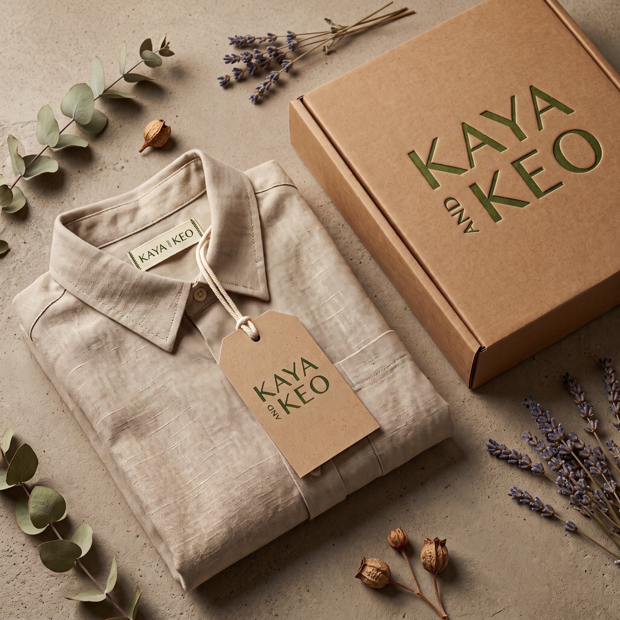
Kaya and Keo
-
![]()
Ophelia | Brow Artist
-
![]()
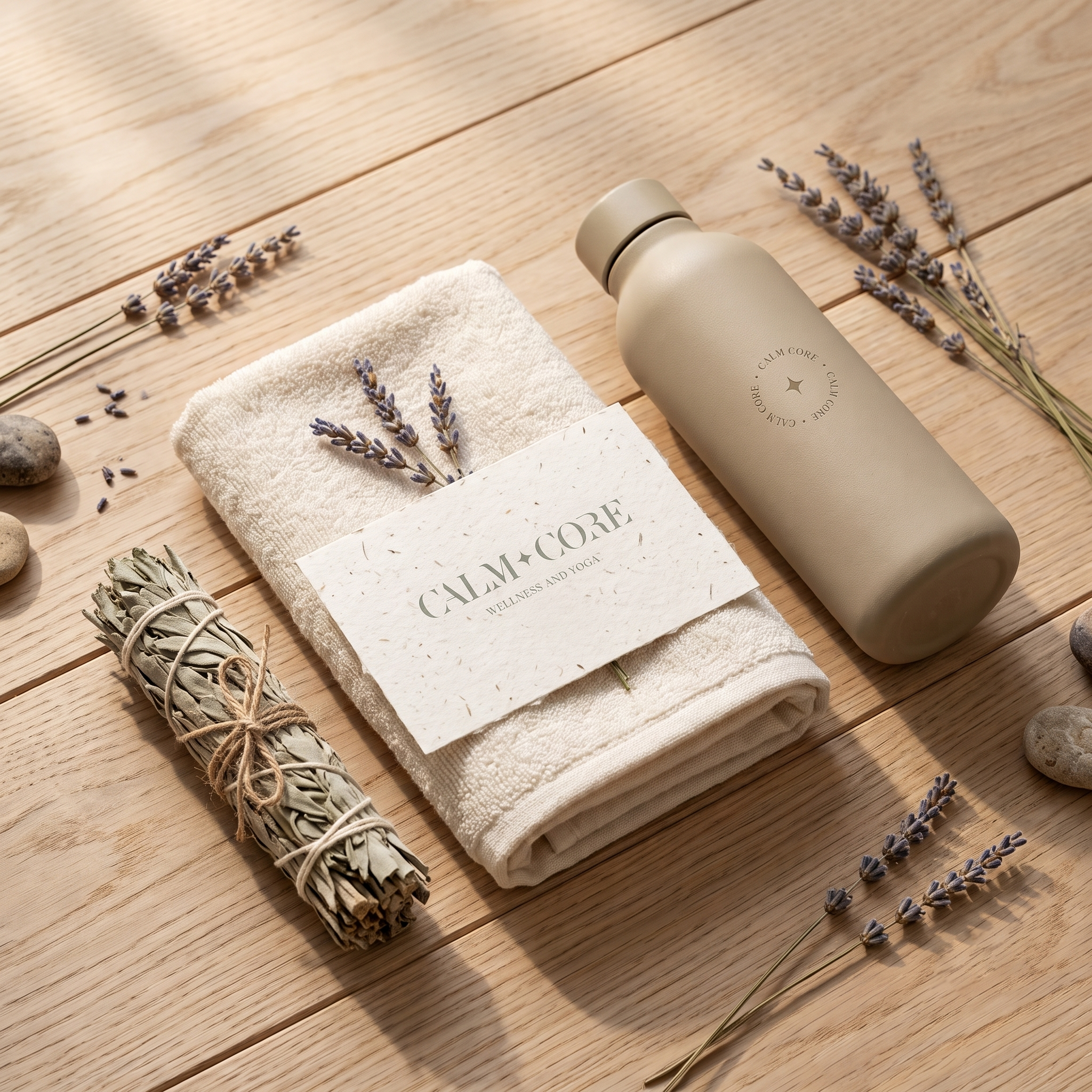
Calm & Core | Wellness and Yoga
-
![]()
Adora | Natural Skincare
-
![]()
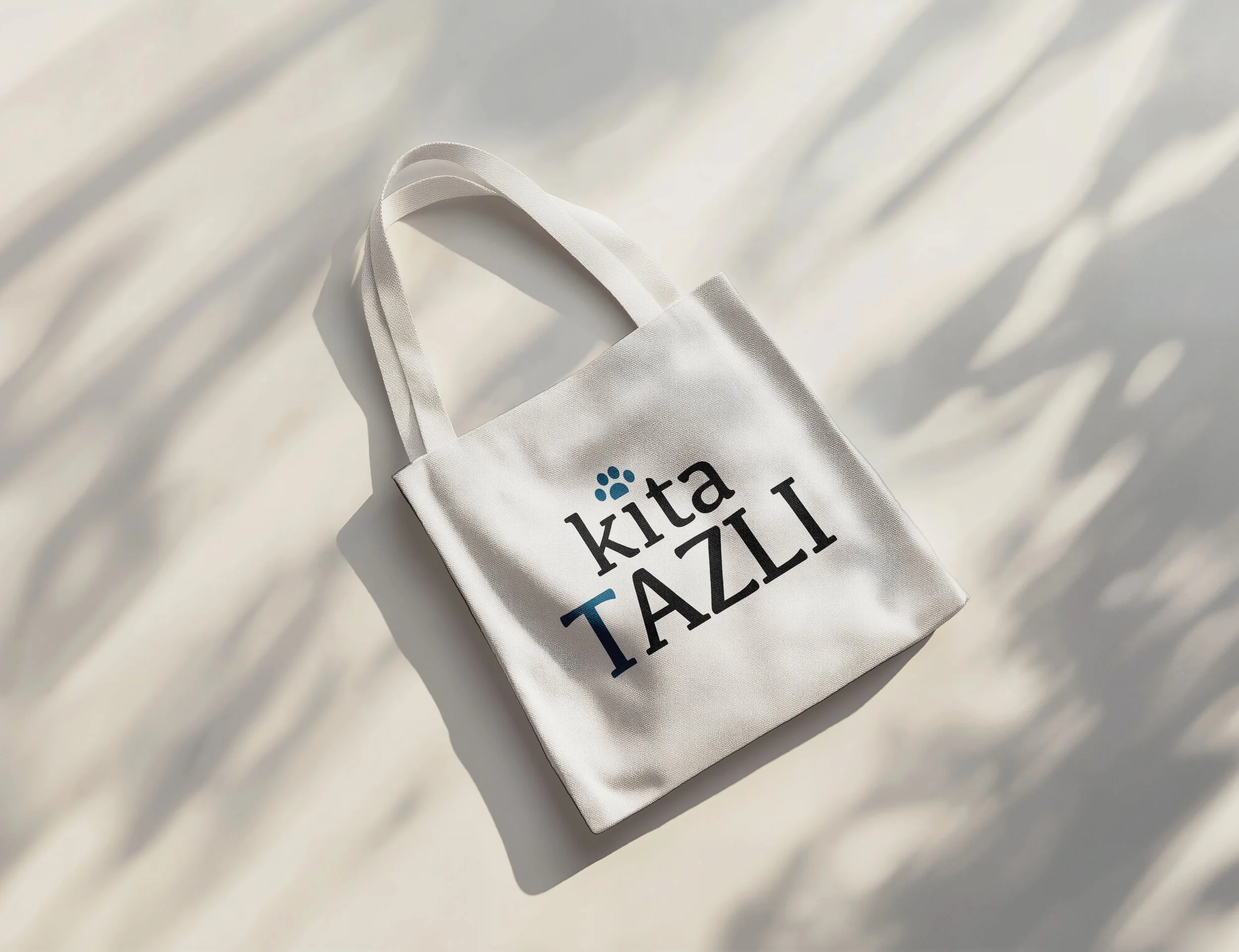
Kita Tazli

Portfolio
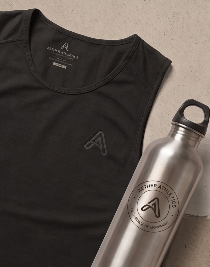
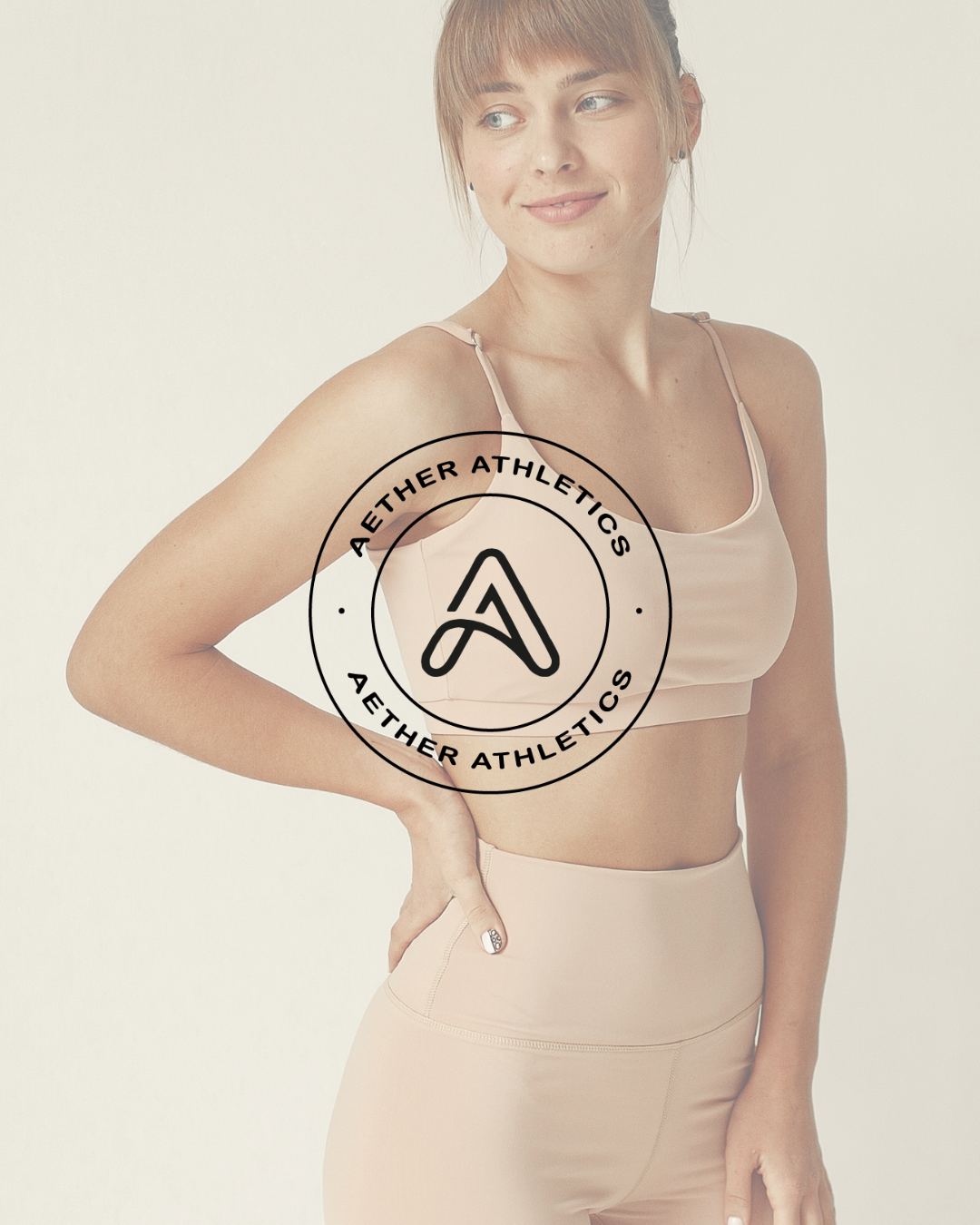
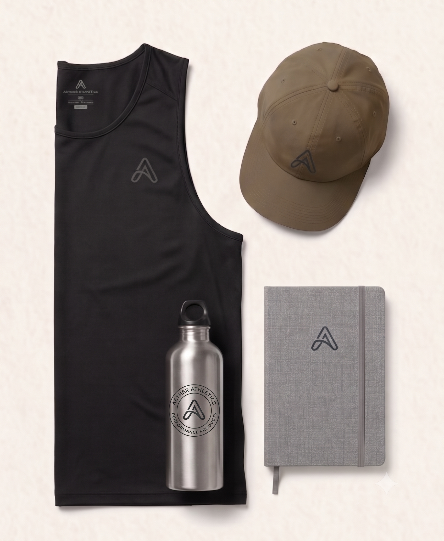
Aether Athletics - The Science of Movement
In a space saturated with loud trends and visual clutter, how does an athletic brand anchored in data and discipline make its mark? For Aether Athletics, the response is pure clarity: a visual identity designed specifically for the art of human biomechanics.
Engineered for Motion
This system balances understated elegance with technical rigor, created to elevate both physical gear and digital experiences.
Adaptive Monogram: The continuous loop of the primary mark blends fluid motion with structural balance, reflecting the natural cadence of training.
Grounded Color Scheme: Deep Slate, Desert Dust, and Solid Black replace typical neon accents with a refined, tactile palette suited for high-level performance.
Modular Versatility: Clean grid alignments allow the system to scale fluidly across software interfaces, physical apparel, and community accessories.
Role: Brand Strategy, Visual Identity, Logo Design
Designer: Irina, Kay Studio Co
Year: 2026
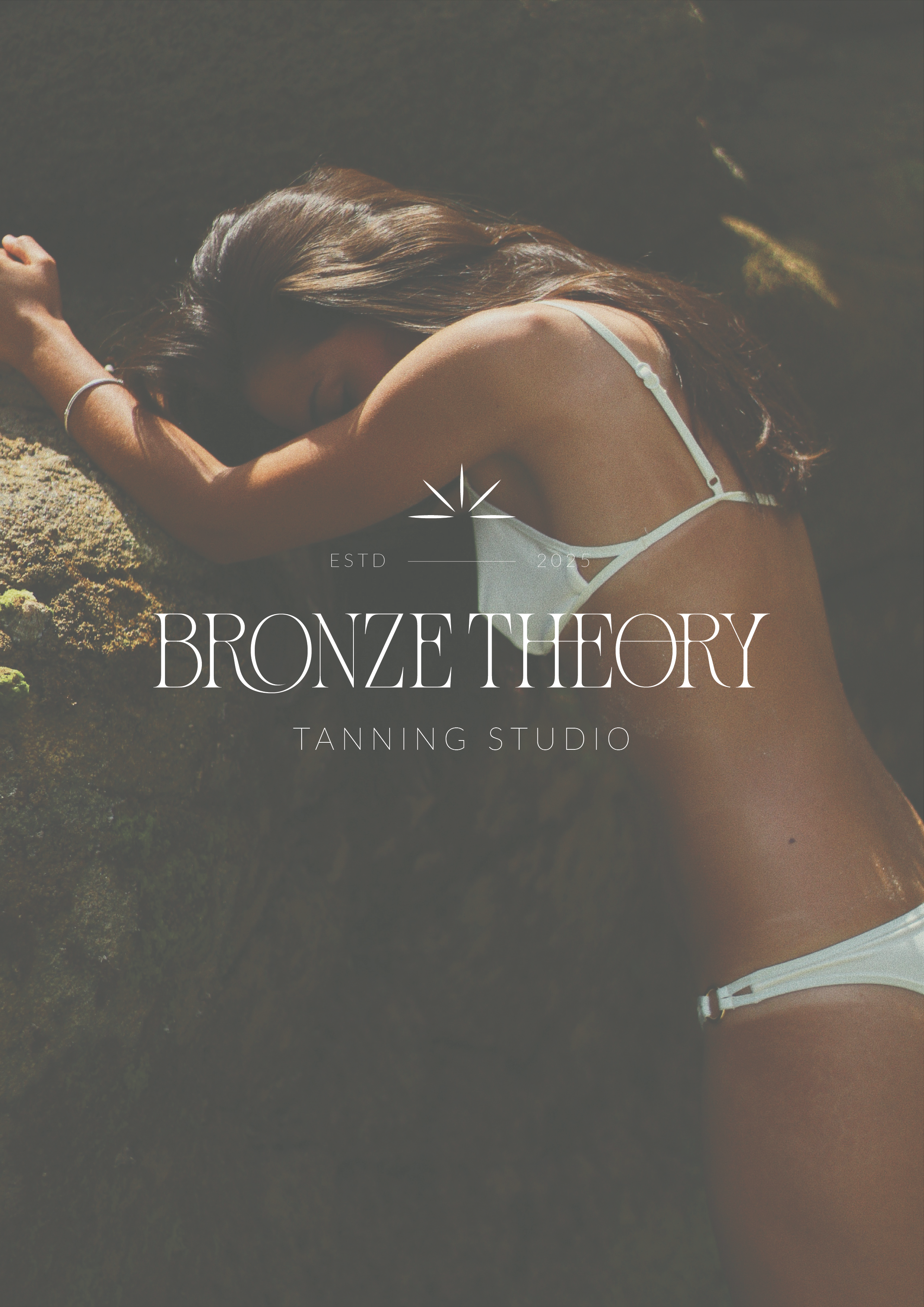
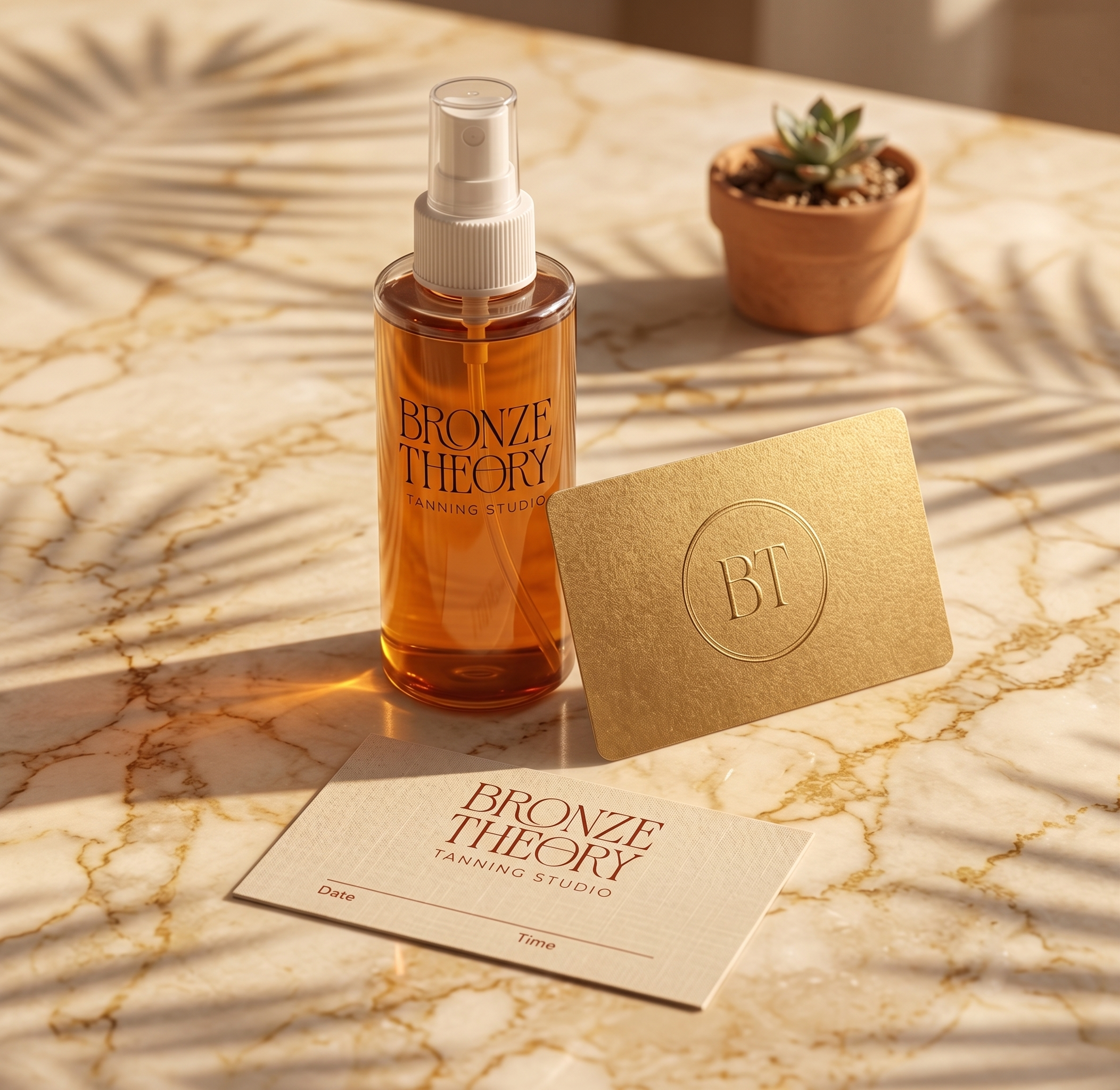
Bronze Theory Tanning Studio
Redefining the Glow: A Luxury Brand Identity for Bronze Theory
The tanning industry often leans on predictable tropical motifs. Bronze Theory wanted to transcend these conventions and establish itself as a modern confidence-building ritual. Our challenge: create a brand that feels like a luxury beauty edit, not a seasonal service.
The identity is built on editorial restraint. A sculptural, high-contrast serif wordmark acts as a permanent fixture of elegance. It’s balanced by a minimalist type system and a warm, sun-touched neutral palette that whispers sophistication. Every touchpoint, from digital presence to in-studio signage, carries this calm, cohesive confidence.
This is branding as elevated experience. Bronze Theory now stands apart—not as a tanning studio, but as a destination for intentional self-care.
Designed independently in 2025, this project reflects Kay Studio Co’s approach to branding: strategic, minimal, and built for longevity.
Role: Brand Strategy, Visual Identity, Logo Design
Designer: Irina, Kay Studio Co
Year: 2025
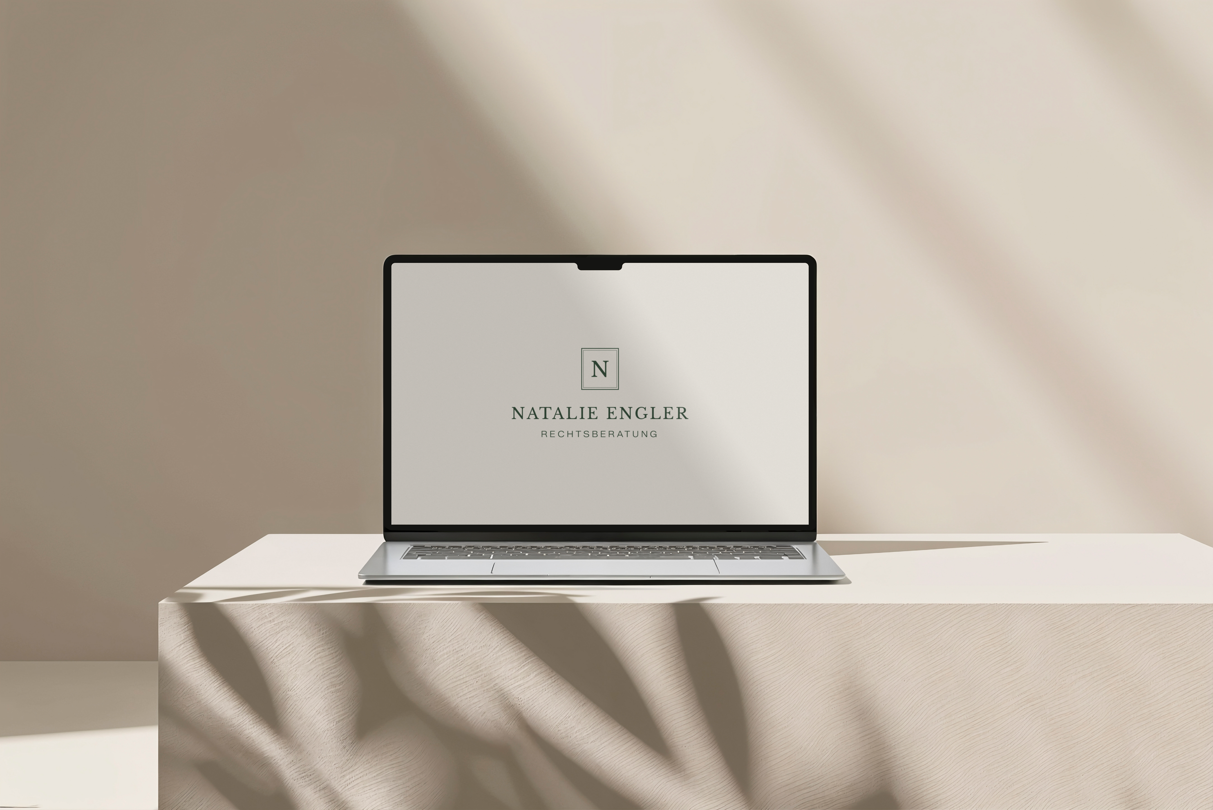
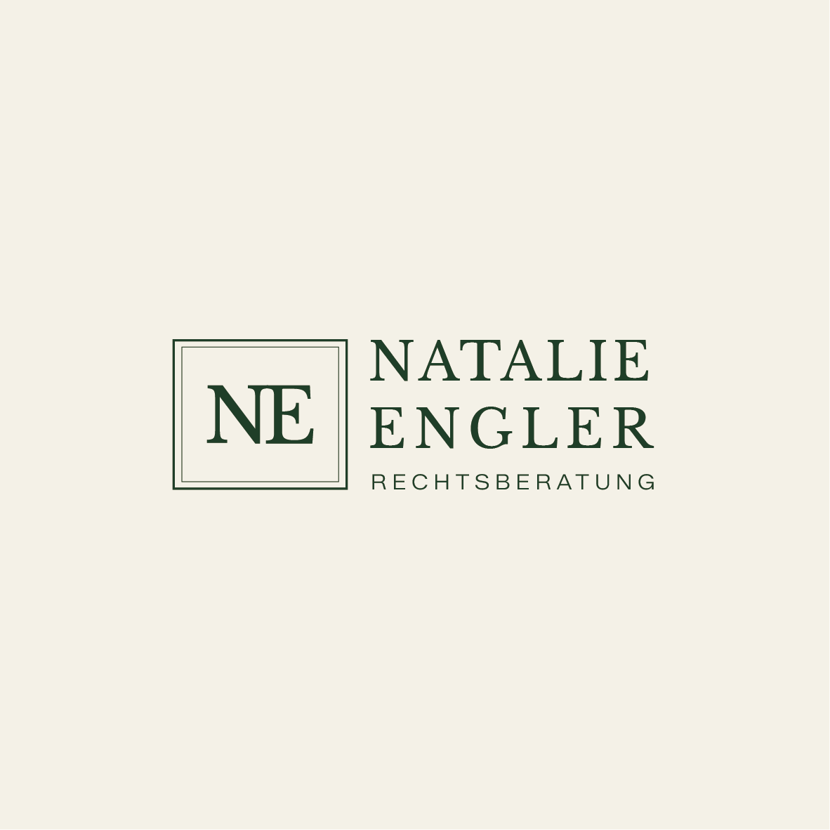
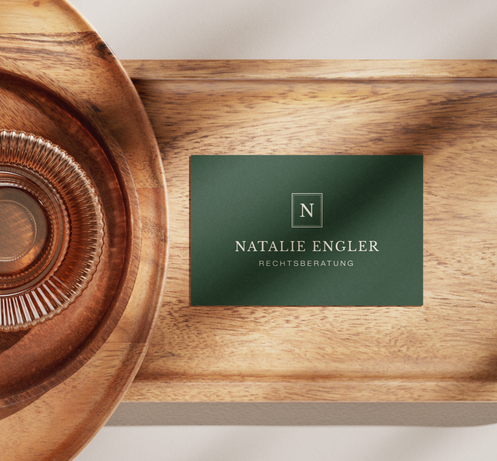
A Warm Brand Identity for Natalie Engler
The legal industry often feels clinical, defined by cold marble and impenetrable jargon. Natalie Engler Rechtsberatung sought to dismantle these barriers, establishing a practice rooted in clarity, empathy, and accessible expertise. The challenge: create a brand that feels like a trusted partnership—a guiding light through complex legal landscapes—rather than a traditional, distant service.
The identity is built on approachable professionalism. A classic serif wordmark provides a foundation of traditional trust and seriousness. It is balanced by a clean, minimalist type system and a warm, "sun-touched" palette of neutrals and earthy tones that whisper security rather than industry coldness.
Every touchpoint, from the digital presence to the soft-lit, "Kinfolk-inspired" photography style, carries a sense of calm, cohesive confidence. This is legal counsel as an elevated, human experience. Natalie Engler now stands apart—not just as a legal professional, but as a destination for clarity, safety, and intentional support.
Role: Brand Strategy, Visual Identity, Logo Design, Web Design
Designer: Irina, Kay Studio Co
Year: 2026
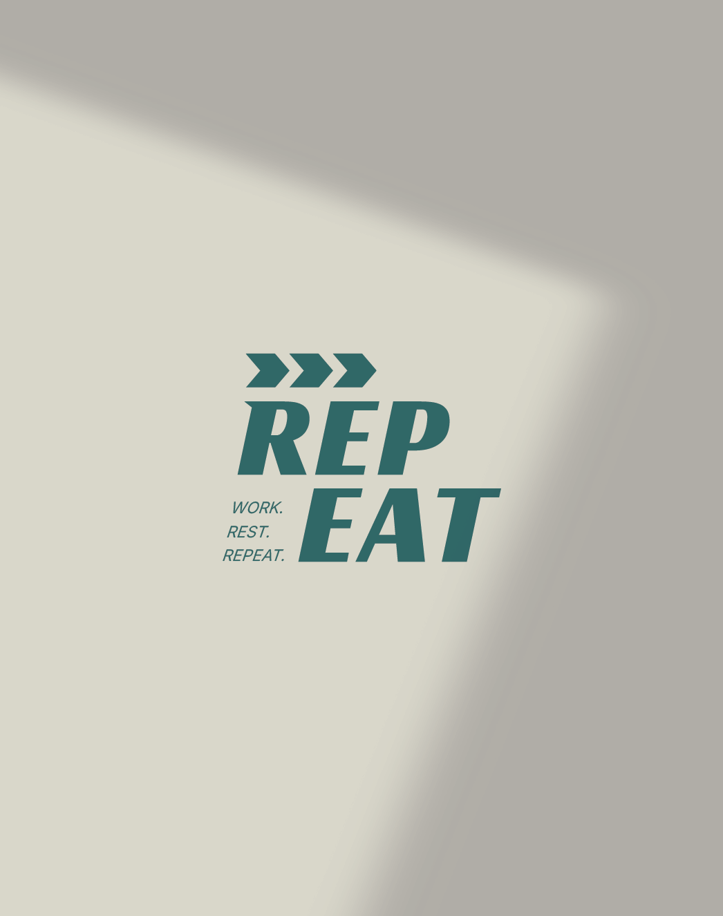
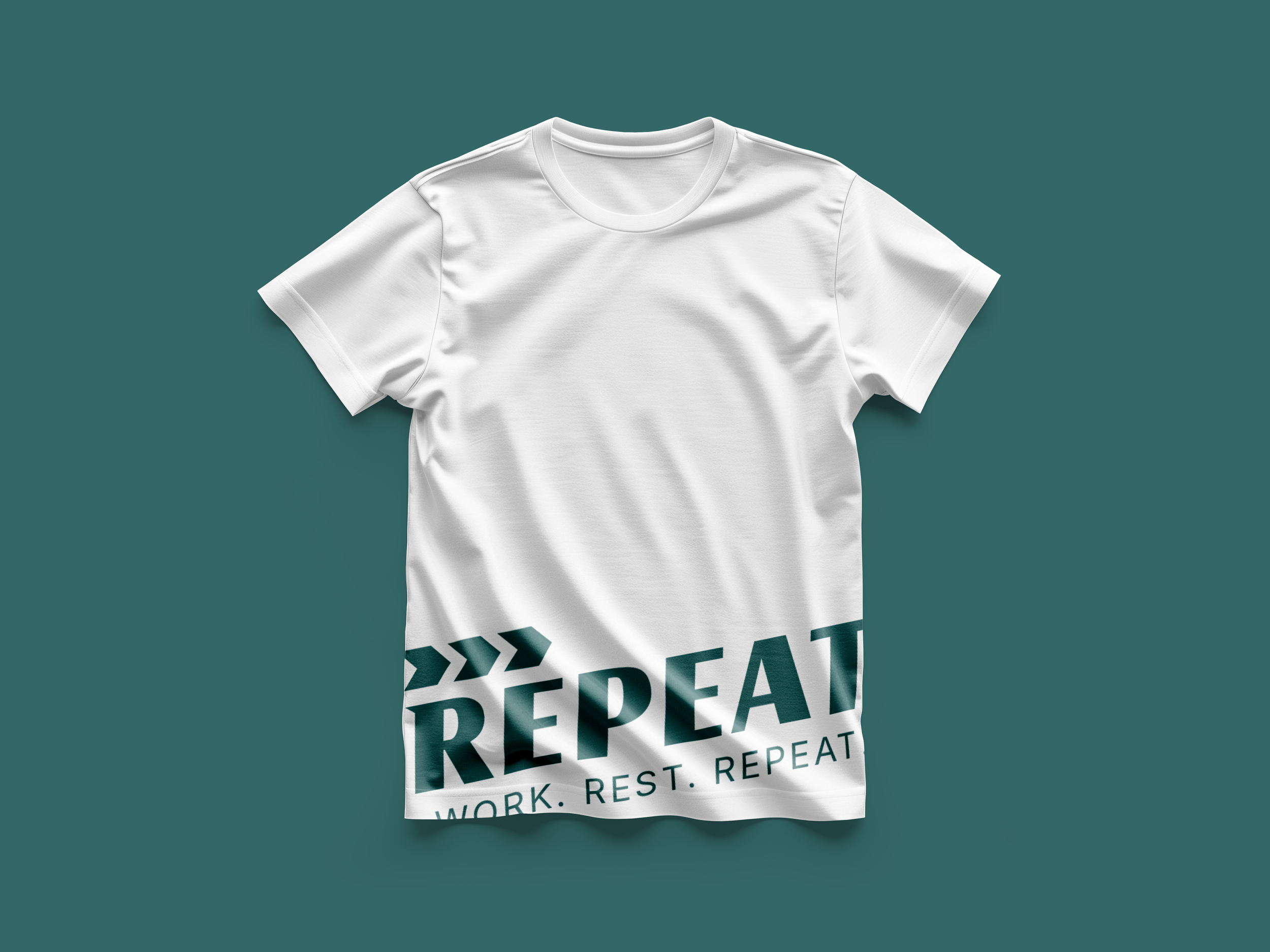
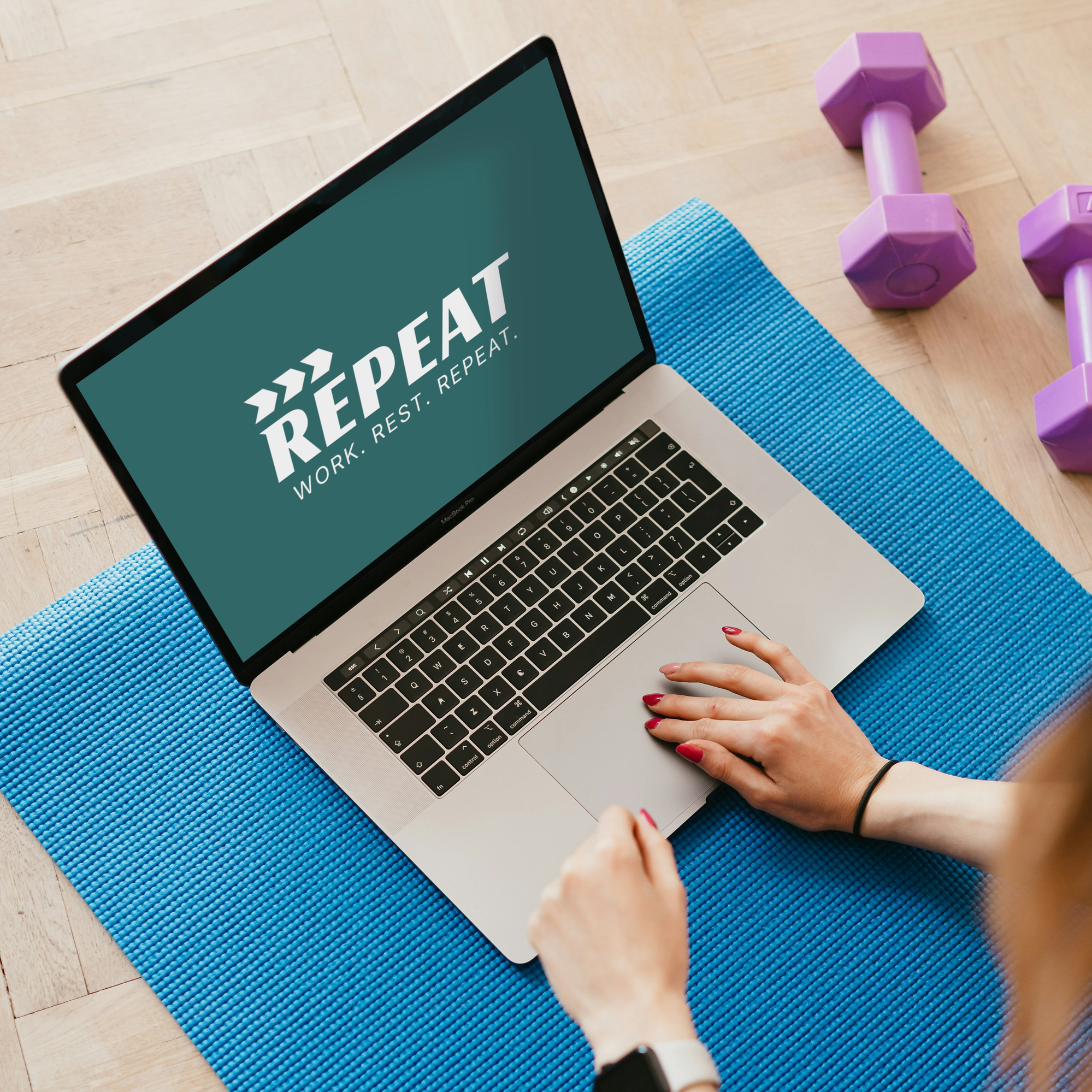

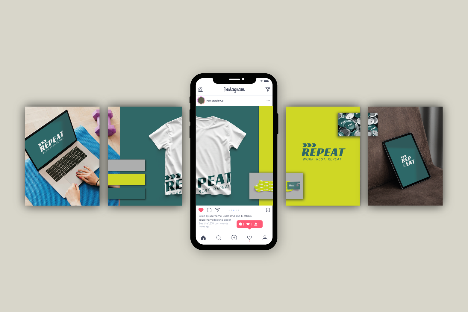
A Visual Identity for REPEAT
In a world of fleeting fitness fads and loud, chaotic gym culture, how does a run club centered on discipline and longevity find its pulse? For REPEAT, a community built on the relentless pursuit of progress, the answer was found in the beauty of the grind: a brand that moves with the athlete.
The Anatomy of the Repeat
This identity is a masterclass in kinetic energy and structural balance. It centers on a bold, forward-leaning aesthetic that mimics the lean of a sprinter and the steady pace of a marathoner.
Dynamic Typography: The primary wordmark is weighted for impact, utilizing a "stutter" graphic element that mirrors the mechanical precision of a stopwatch and the rhythmic strike of a shoe on pavement.
The Palette of Focus: A high-contrast pairing of deep, oceanic teal and "Electric Sulphur" yellow provides high-visibility energy. Balanced by muted greys, the palette feels both professional and intensely active—signaling a space that is as much about the hard work as it is the high-tier experience.
Systematic Motion: From the digital interface to the physical kit, the layout follows a rigid grid system that allows for modular flexibility. Whether it’s a laptop screen or a t-shirt, the "WORK. REST. REPEAT." mantra remains the grounding anchor.
Role: Brand Strategy, Visual Identity, Logo Design
Designer: Irina, Kay Studio Co
Year: 2026
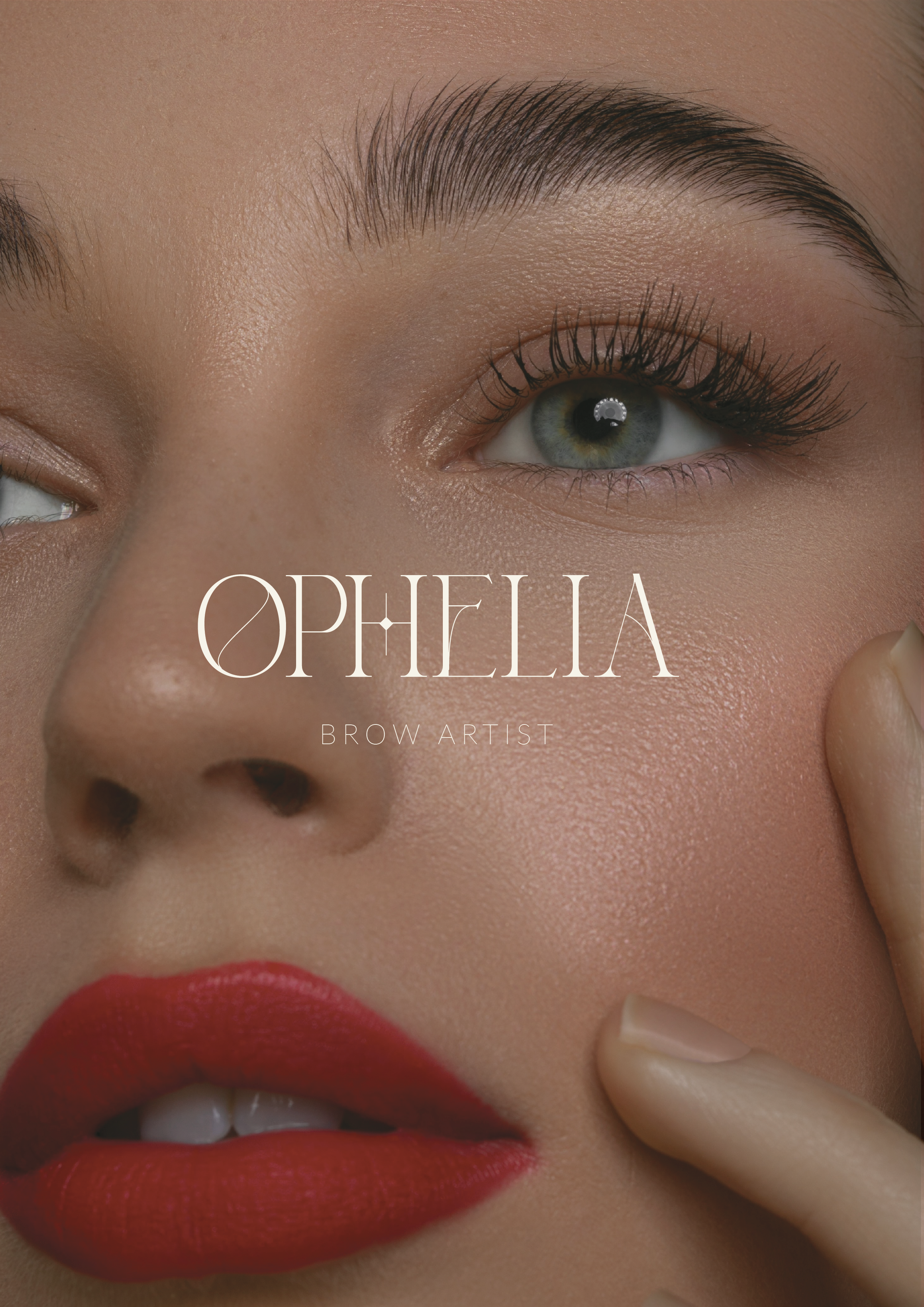
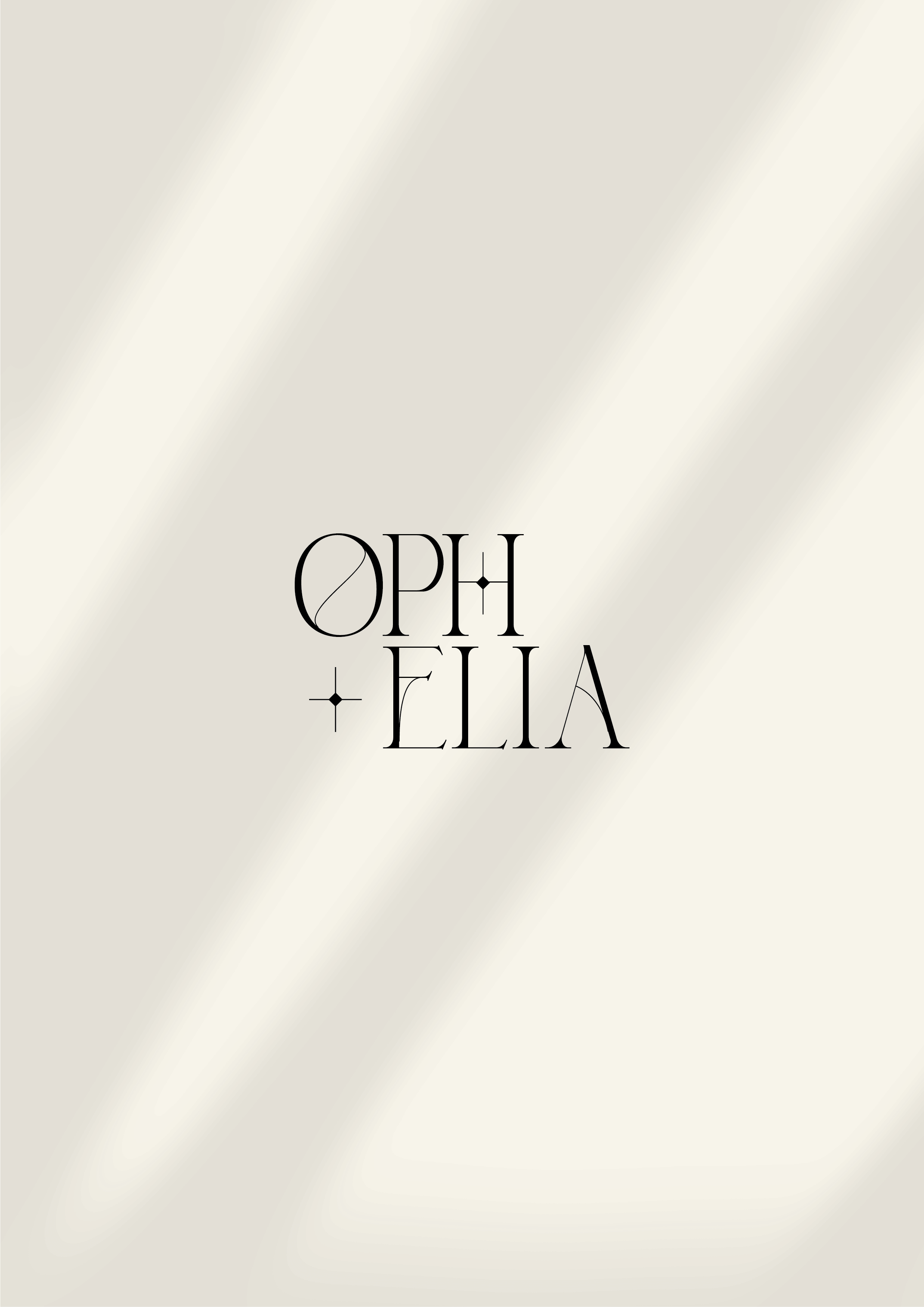

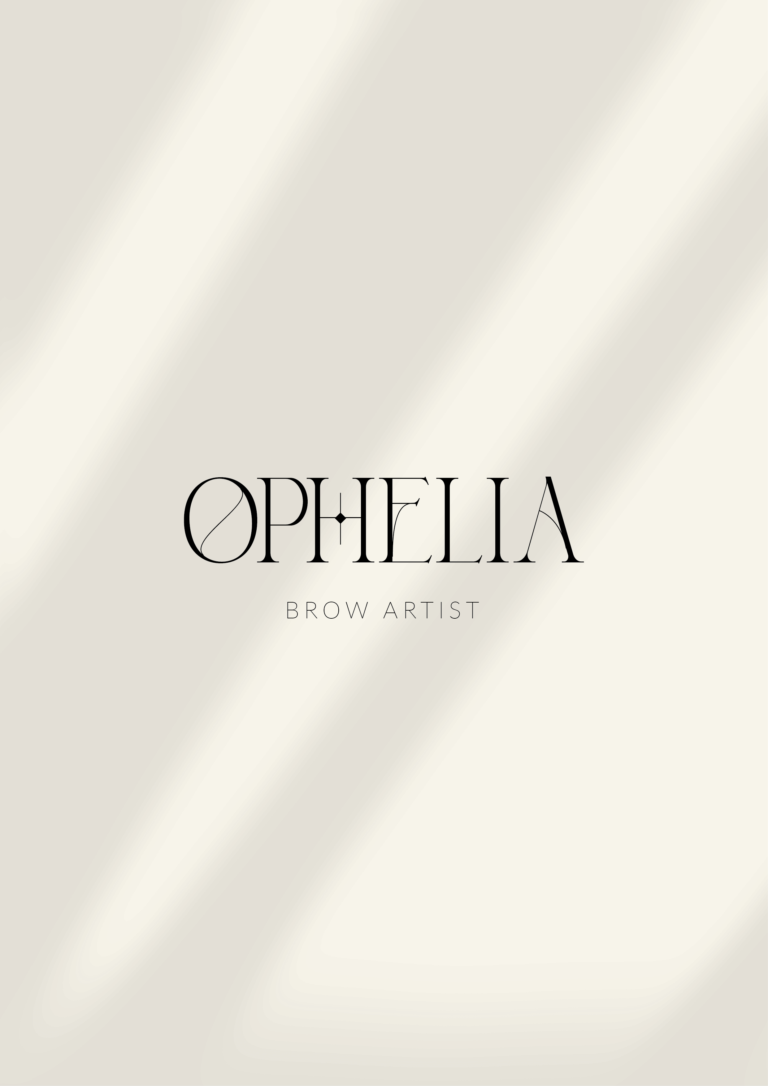
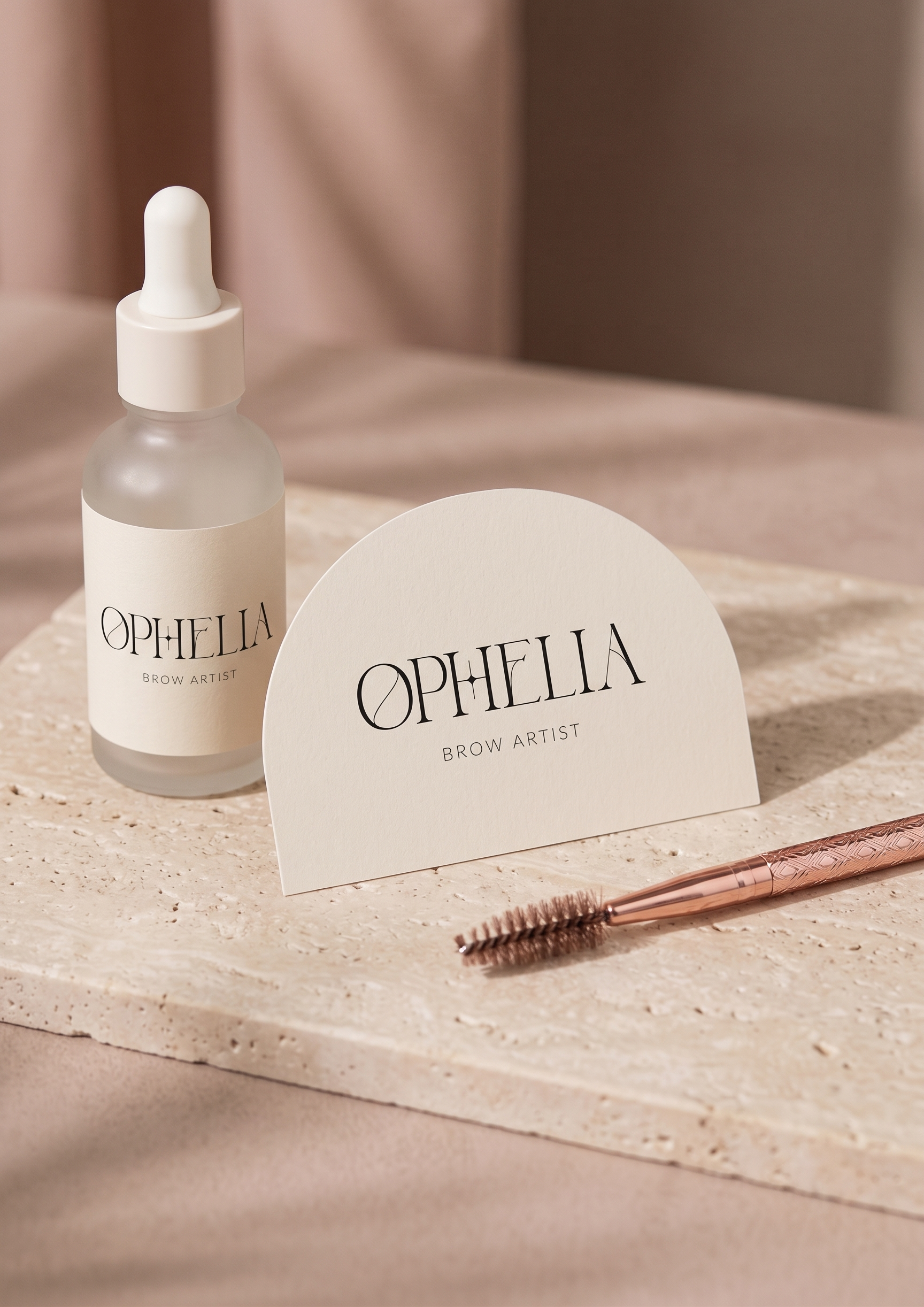
Ophelia Brow Artist
The Architecture of Beauty: A Brand Identity for Ophelia
In the age of overly styled, trend-driven beauty, how does an artist known for quiet precision stand out? For Ophelia, a brow specialist of exceptional skill, the answer was not to shout, but to build an enduring world of calm confidence.
This identity is a study in restraint and intention. The foundational high-contrast serif is a precise instrument—its elegant letterforms signaling expertise. It’s balanced by a clean typographic system and a whisper-quiet neutral palette that exudes a curated, editorial calm. The composition is minimal by design, ensuring the spotlight remains on Ophelia’s artistry and the client’s transformation.
The result is more than a logo. It’s a cohesive brand ecosystem that positions Ophelia not as a service provider, but as the definitive destination for considered, detail-driven beauty.
Role: Brand Strategy, Visual Identity, Logo Design
Designer: Irina, Kay Studio Co
Year: 2025
Alchemē Spa Collective
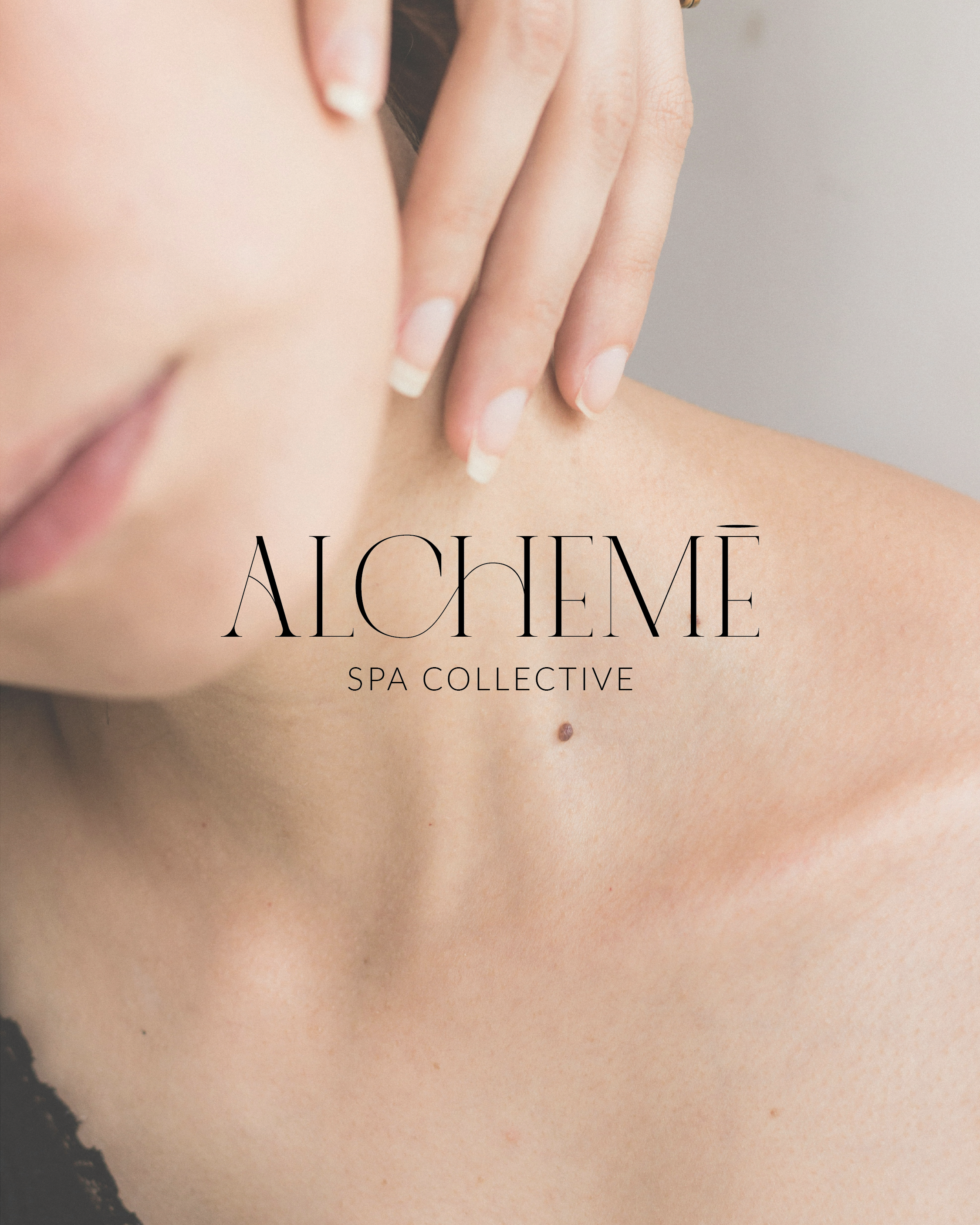
Alchemē Spa Collective: Branding a New Category of Wellness
Modern self-care has evolved beyond isolated treatments. Alchemē Spa Collective was founded on a more profound vision: wellness as a shared, restorative ritual. Our challenge was to create a visual language for this new category—one that felt less like a transactional space and more like a grounded, intentional community.
The identity is built on the principle of quiet transformation. A bespoke serif wordmark, with its balanced letterforms, acts as an anchor of calm. It’s enveloped by a soft, earthen colour palette and a meticulously scaled typographic system that together evoke a sense of sanctuary. Every detail—from custom iconography to spatial graphics—is designed to feel serene and continuous, inviting guests into a cohesive experience from first touchpoint to final moment of rest.
The result is a brand that doesn’t just announce a spa, but cultivates an atmosphere. Alchemē is now positioned as a destination for collective restoration, where the environment itself is part of the healing ritual.
Role: Brand Strategy, Visual Identity, Logo Design
Designer: Irina, Kay Studio Co
Year: 2025