
Adora
Natural Skincare
A luxury, botanical brand identity and packaging system positioning clean skincare as an editorial self-care ritual.
Client: ADORA Natural Skincare
Studio: Irina, Kay Studio Co
Year: 2026
Role & Deliverables: Brand Strategy, Visual Identity Systems, Custom Serif Wordmark with Interlocking Ligatures, Logo Suite (Primary, Stacked, Submark Seal), Packaging Design (Unfolding Outer Cartons, Glass Dropper Bottles, Cream Jars), Brand Guidelines
-
Natural skincare often struggles to balance botanical purity with luxury aesthetics—frequently leaning toward clinical apothecary looks or raw, unrefined rustic packaging. ADORA was created to bridge this gap, offering high-performance, botanical formulations presented through an editorial, high-fashion lens.
Kay Studio Co developed a visual system anchored in fluid typographic ligatures and warm, blush-tone earth hues. The identity elevates ADORA into a luxury beauty staple, proving that clean ingredients and elevated packaging belong together seamlessly.
-
To position ADORA as a standout brand in the crowded clean beauty space, the identity needed to communicate organic purity, sensory warmth, and understated luxury.
Our strategy focused on three core objectives:
Elevate Natural Skincare: Move away from generic leaf icons and raw brown Kraft paper in favor of a sophisticated, tactile aesthetic.
Design an Iconic Typographic Signature: Craft a custom wordmark featuring fluid letterform connections that become an instantly recognizable mark of quality.
Build a Cohesive Packaging Ecosystem: Structure outer boxes, glass serum droppers, and cream jars into a seamless, tactile unboxing experience.
-
1. Custom Interlocking Serif Typography
The heart of the visual identity is a high-contrast serif wordmark featuring custom fluid connections:
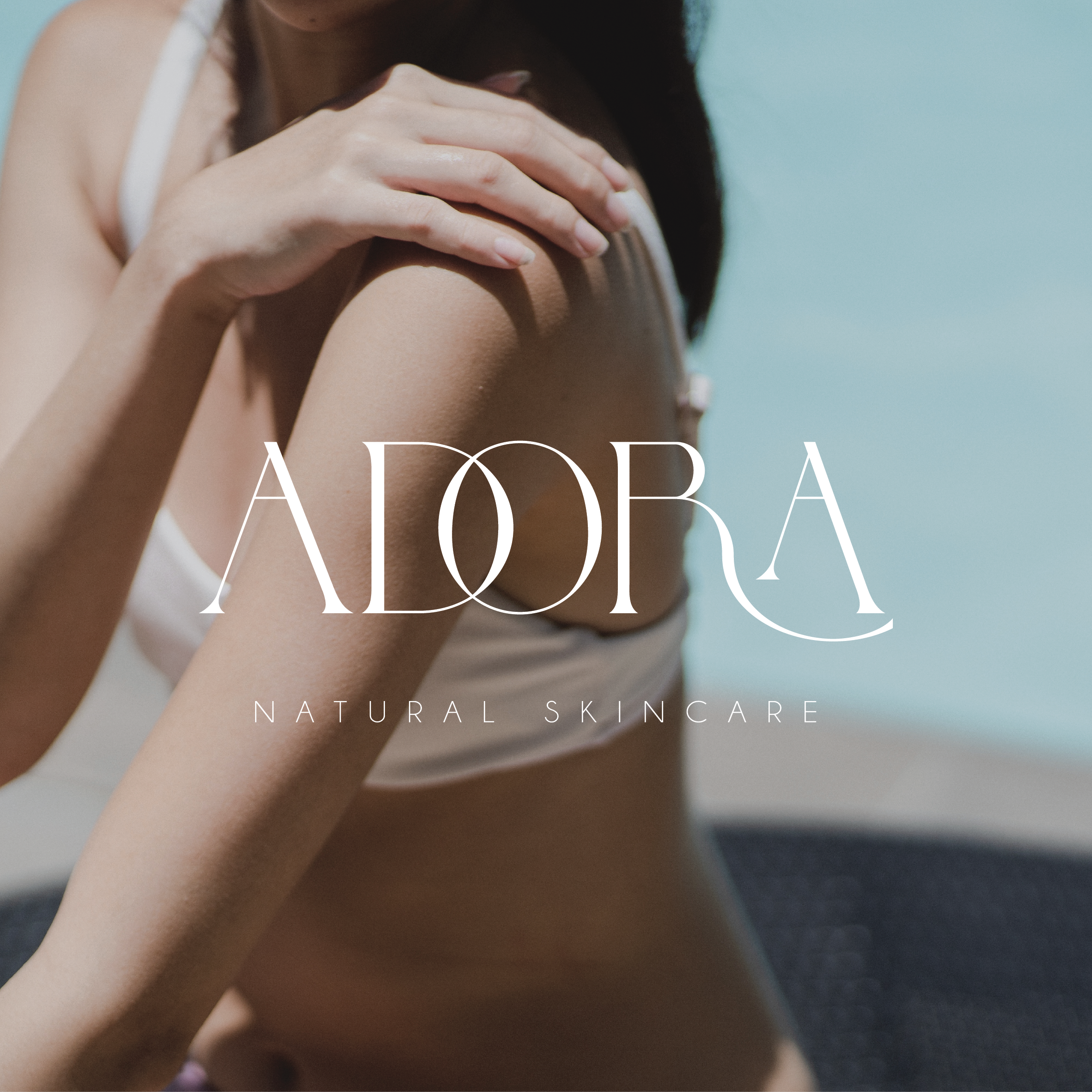
Interlocked 'DO' Ligature: The curved bowl of the 'D' seamlessly weaves through the 'O', creating a central emblem that symbolizes harmony, balance, and formulation synergy.
Flowing 'R' Swash: The leg of the 'R' extends into a graceful, sweeping swash that cradles the final 'A', adding movement and an organic touch to the logotype.
2. Responsive Identity & Logo Suite
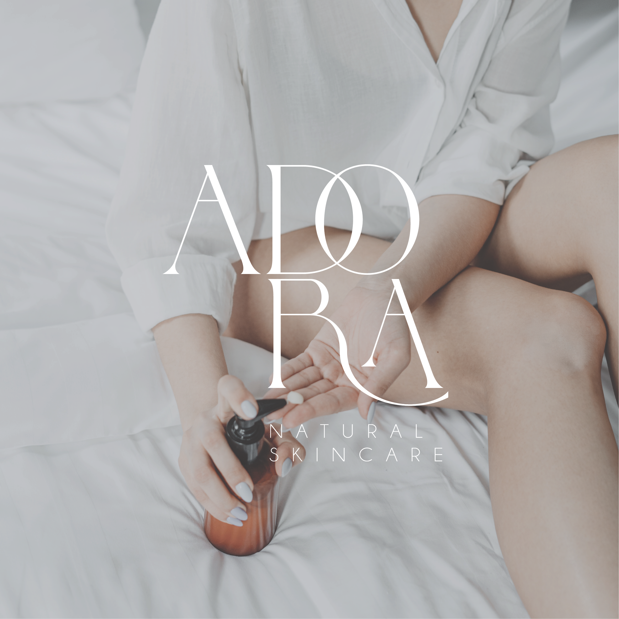
Primary Horizontal Wordmark: The full single-line lockup featuring "ADORA" paired with a widely spaced, clean sans-serif "NATURAL SKINCARE" descriptor.
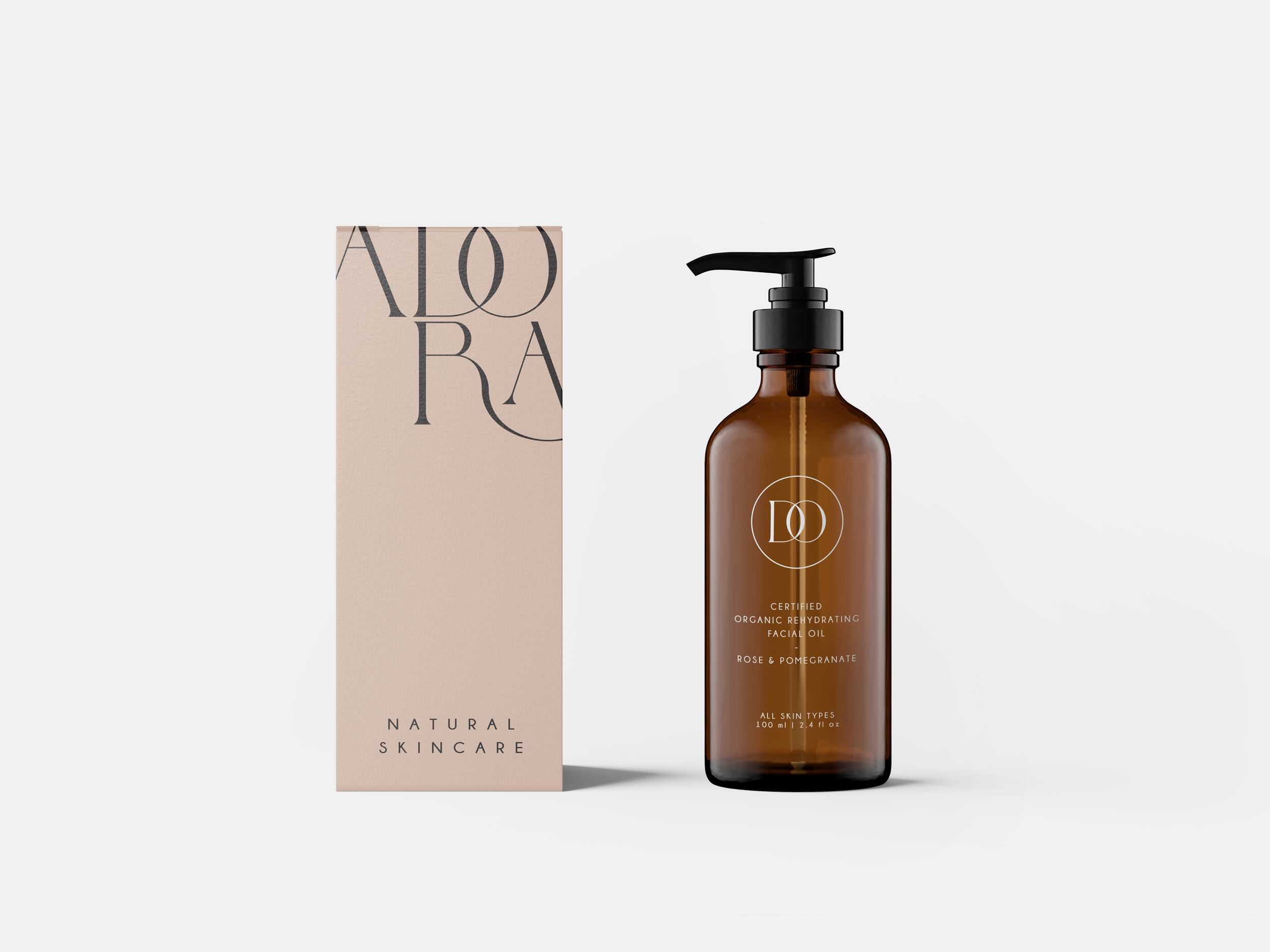
Stacked Editorial Lockup: A compact, two-tier arrangement placing "ADO" directly above "RA"—engineered for narrow packaging panels, vertical carton flaps, and serum bottles.
Interlocked 'DO' Circular Seal: A refined submark enclosing the overlapping 'DO' ligature within a fine-line circle, used for jar lids, carton top flaps, and social media avatars.
3. Warm Botanical Color Palette
Blush Sand & Warm Nude: A soft, tactile neutral palette that mirrors skin tone, natural clays, and botanical extracts.
Deep Charcoal Black: Provides sharp typographic legibility across outer cartons and glass labels.
Natural Wood Accents: Paired with frosted glass and bamboo dropper tops to ground the luxury packaging in organic materials.
-
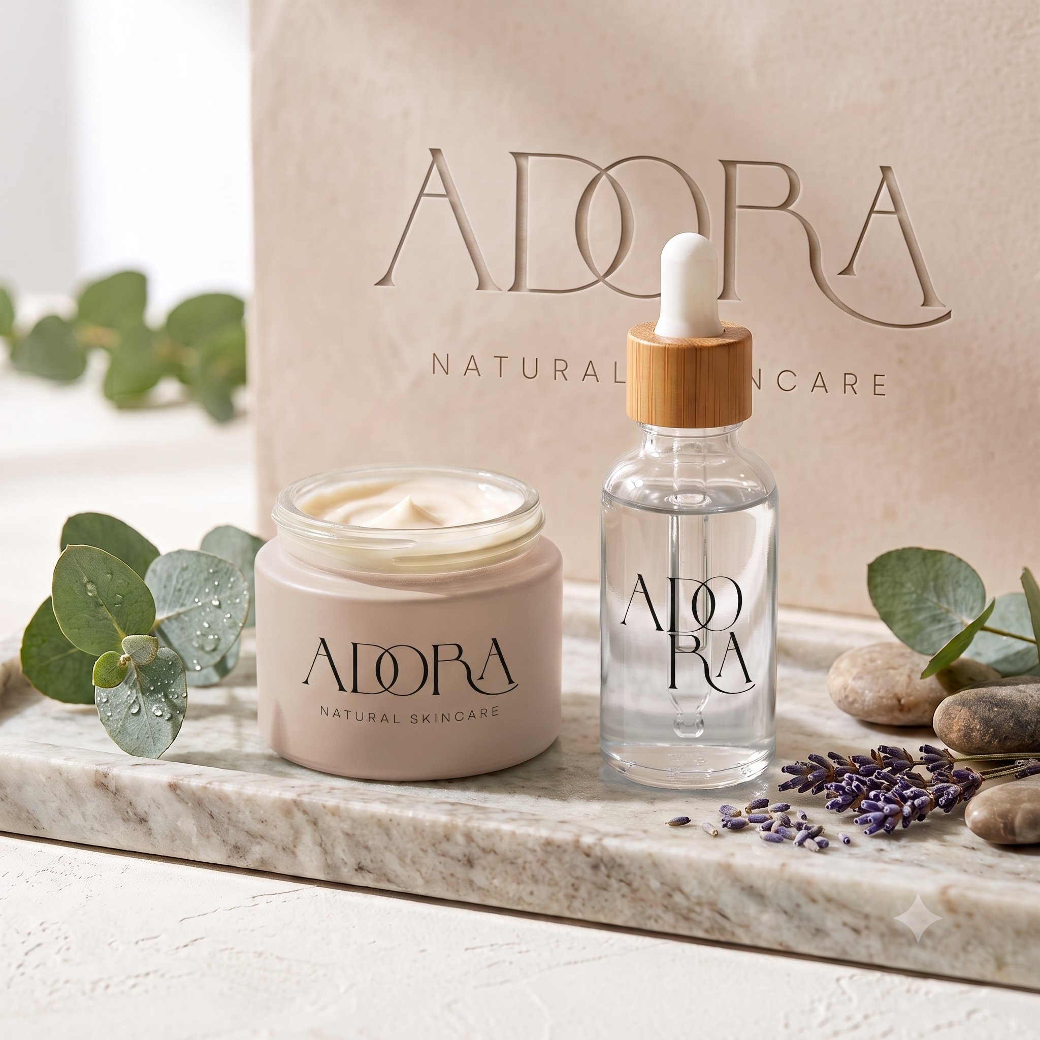
Skincare Containers: Frosted glass serum droppers with natural wooden tops featuring the stacked "ADO / RA" mark, alongside blush nude cream jars carrying the primary horizontal wordmark.
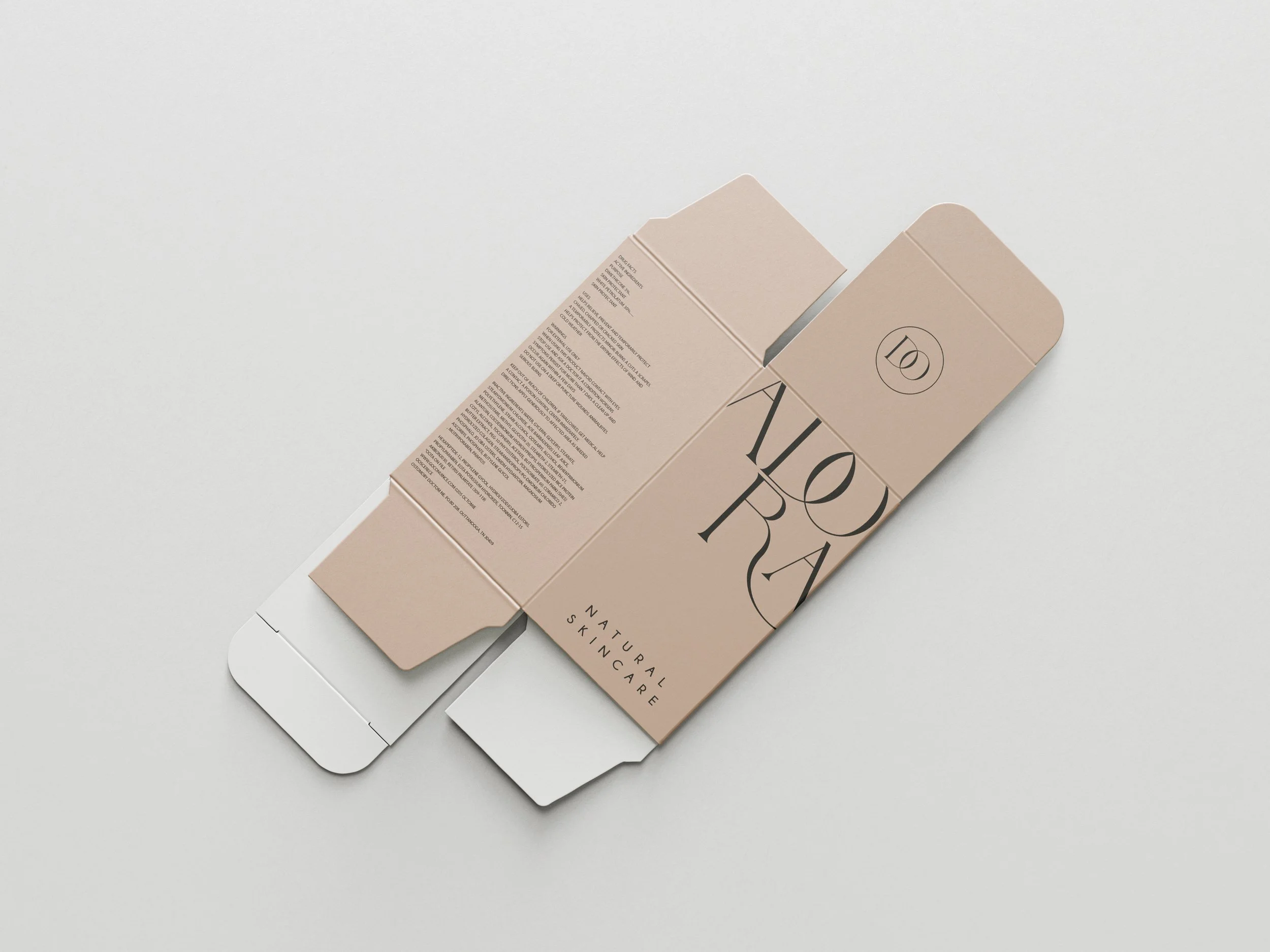
Structural Outer Cartons: Custom die-cut folding boxes in blush sand featuring the stacked logo down the main face, detailed ingredient spec copy along the side panels, and the circular 'DO' seal debossed on the top flap.
Digital & Campaign Suite: An editorial web design and promotional campaign layout treating skincare formulations as fine art through soft shadows, natural stone trays, and botanical greenery.
-
By combining sculptural typography with warm, tactile packaging, ADORA establishes a distinct visual identity in the clean beauty market. The flexible logo suite allows the brand to scale effortlessly across diverse product formats—delivering an unmistakable mark of purity and luxury from box to bottle.