

Bronze Theory
Tanning Studio
A luxury, editorial brand identity positioning a tanning studio as an elevated self-care ritual.
Client: Bronze Theory Tanning Studio
Studio: Irina, Kay Studio Co
Year: 2025
Role & Deliverables: Brand Strategy, Visual Identity Systems, Custom Typography & Wordmark, Logo Suite (Primary, Stacked, Submark Seal), Brand Guidelines
-
The tanning industry often leans on predictable tropical motifs and loud seasonal graphics. Bronze Theory was created to transcend these conventions and establish itself as a modern, confidence-building ritual.
Kay Studio Co built a strategic identity that transforms the brand into a luxury beauty edit—shifting the perception of tanning from a temporary, seasonal service to a permanent destination for intentional self-care.
-
To break away from industry clichés, the identity needed to communicate warmth, sophistication, and restraint.
The strategy focused on three core objectives:
Elevate Brand Perception: Move away from neon accents and tropical palm graphics in favor of a timeless, high-fashion aesthetic.
Establish Editorial Restraint: Craft a visual voice that feels calm, confident, and warm rather than aggressive or over-promotional.
Build a Flexible System: Develop a responsive set of marks that function seamlessly across digital screens, studio signage, print collateral, and beauty product packaging.
-
1. Custom Sculptural Serif Typography
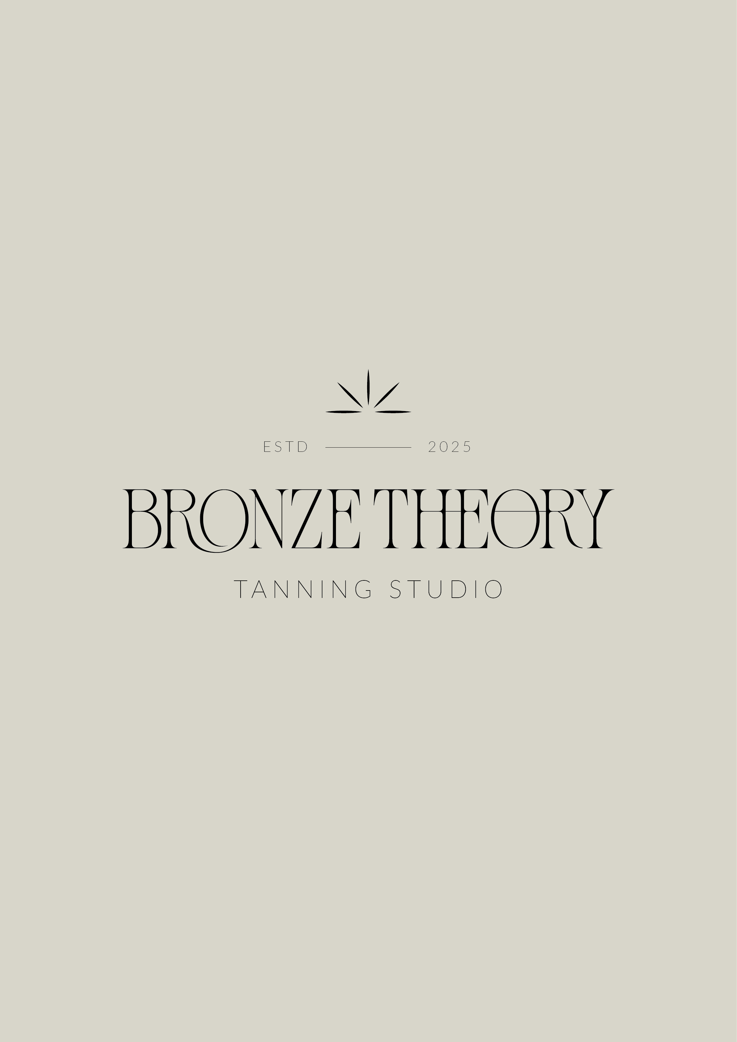
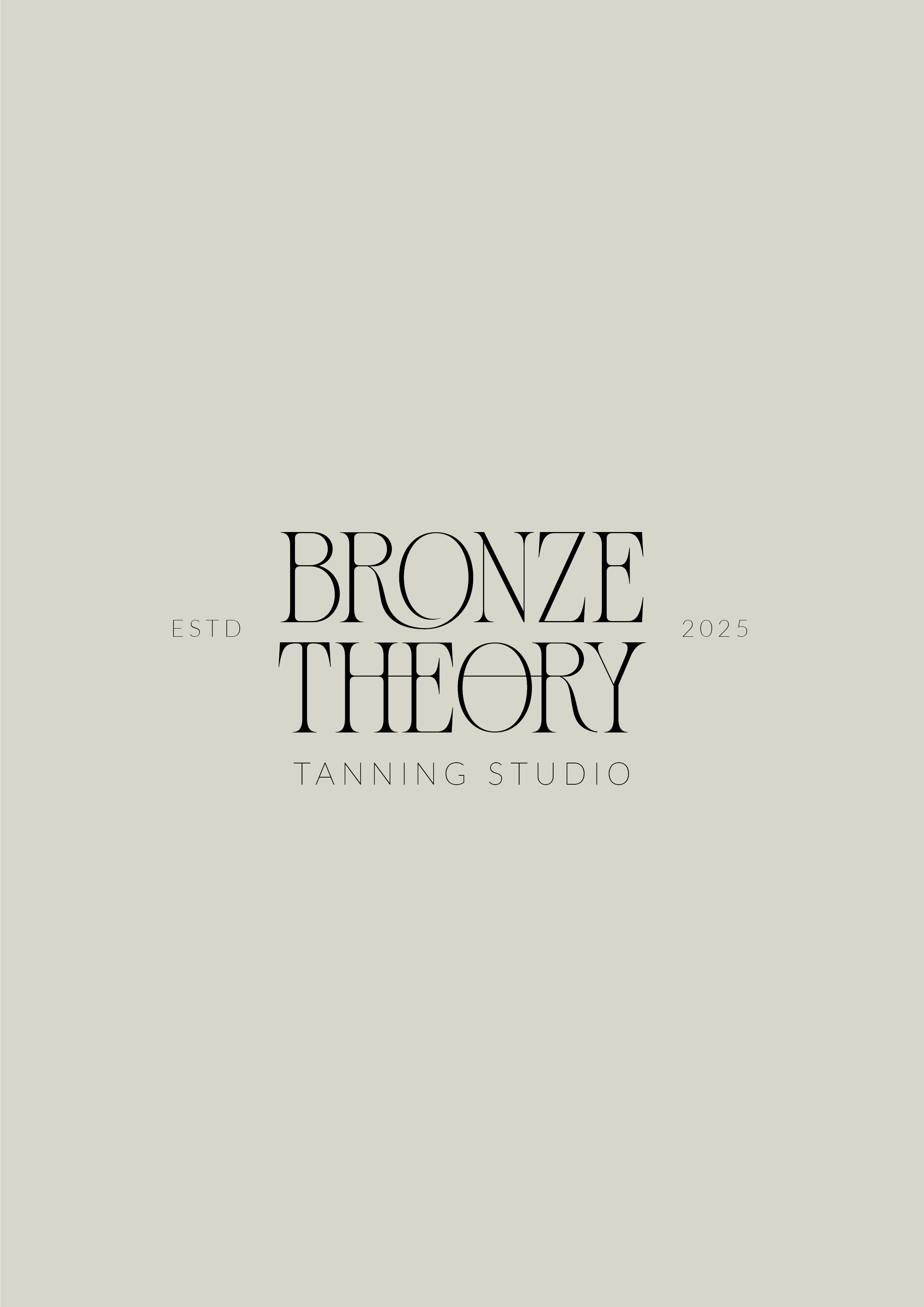
The heart of the visual system is a high-contrast, sculptural serif wordmark. Featuring delicate ligatures, custom letterform connections, and a distinct geometric 'O' detail, the typography conveys quiet elegance and architectural balance.
2. Adaptive Identity Marks
The identity system scales across touchpoints with tailored logo lockups:
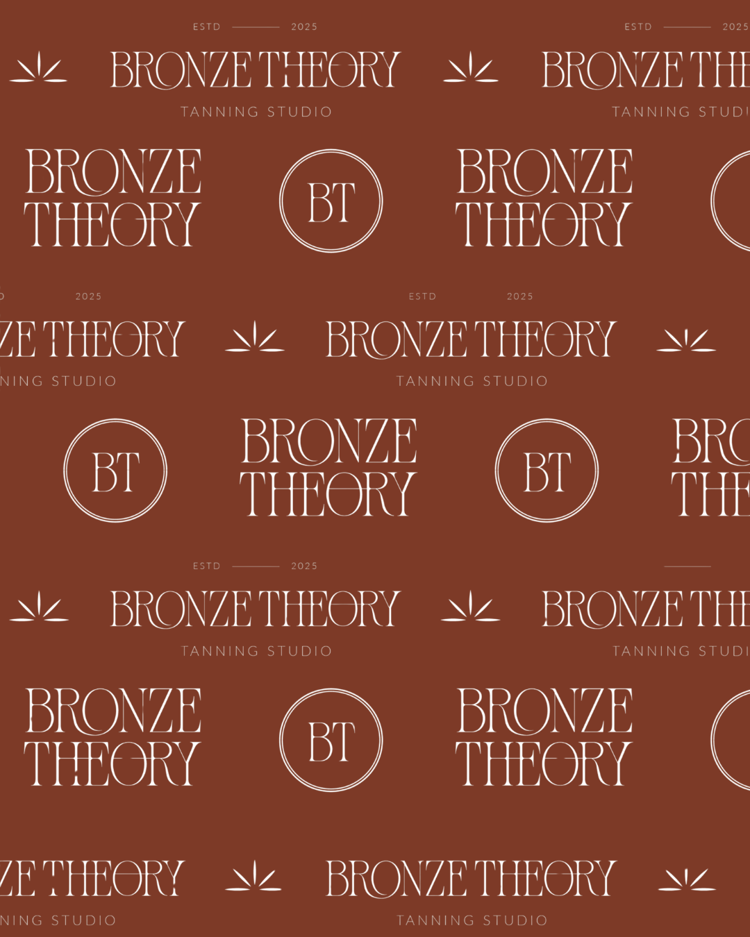
Primary Horizontal Mark: A balanced primary lockup featuring a minimalist sunburst emblem—symbolizing radiant light and warmth.
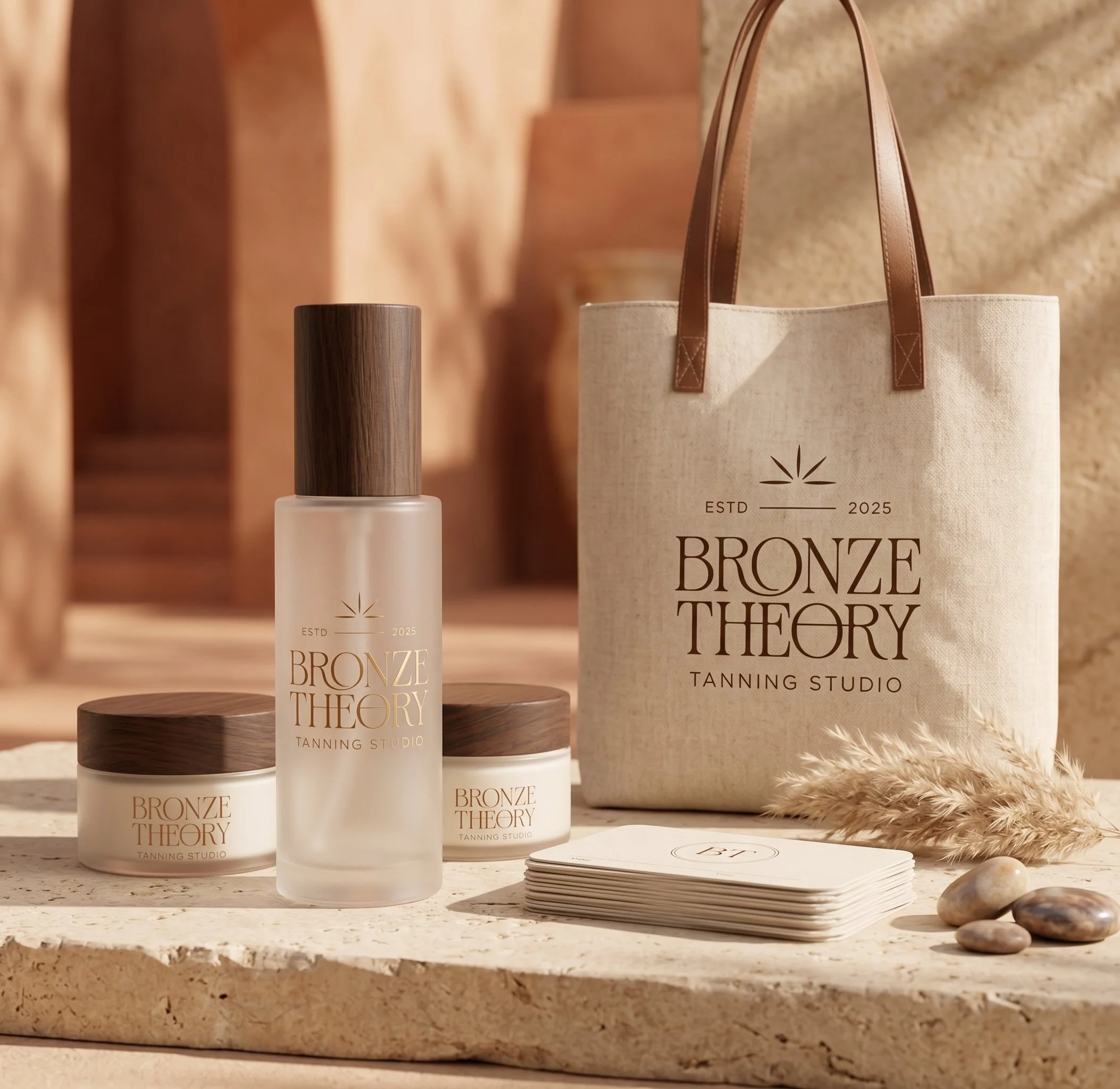
Stacked Secondary Mark: A compact, high-impact vertical arrangement framed by subtle ESTD 2025 markers, ideal for storefront signage and packaging tags.
Submark Seal: A refined circular 'BT' monogram enclosed in fine dual rings, engineered for social media profiles, wax seals, and micro-embroidered merchandise.
3. Earthy, Sun-Warmed Color Palette
Rooted in earthy luxury, the palette contrasts crisp ivory typography (#EAE6DF) against a deep, burnt terracotta bronze (#7A3B28) and warm sand neutrals. This rich terracotta hue grounds the identity, echoing warm skin, fired clay, and late-afternoon sun.
-
In-Studio Experience: Architectural signage, debossed treatment menus, and window graphics utilizing the primary sculptural wordmark.
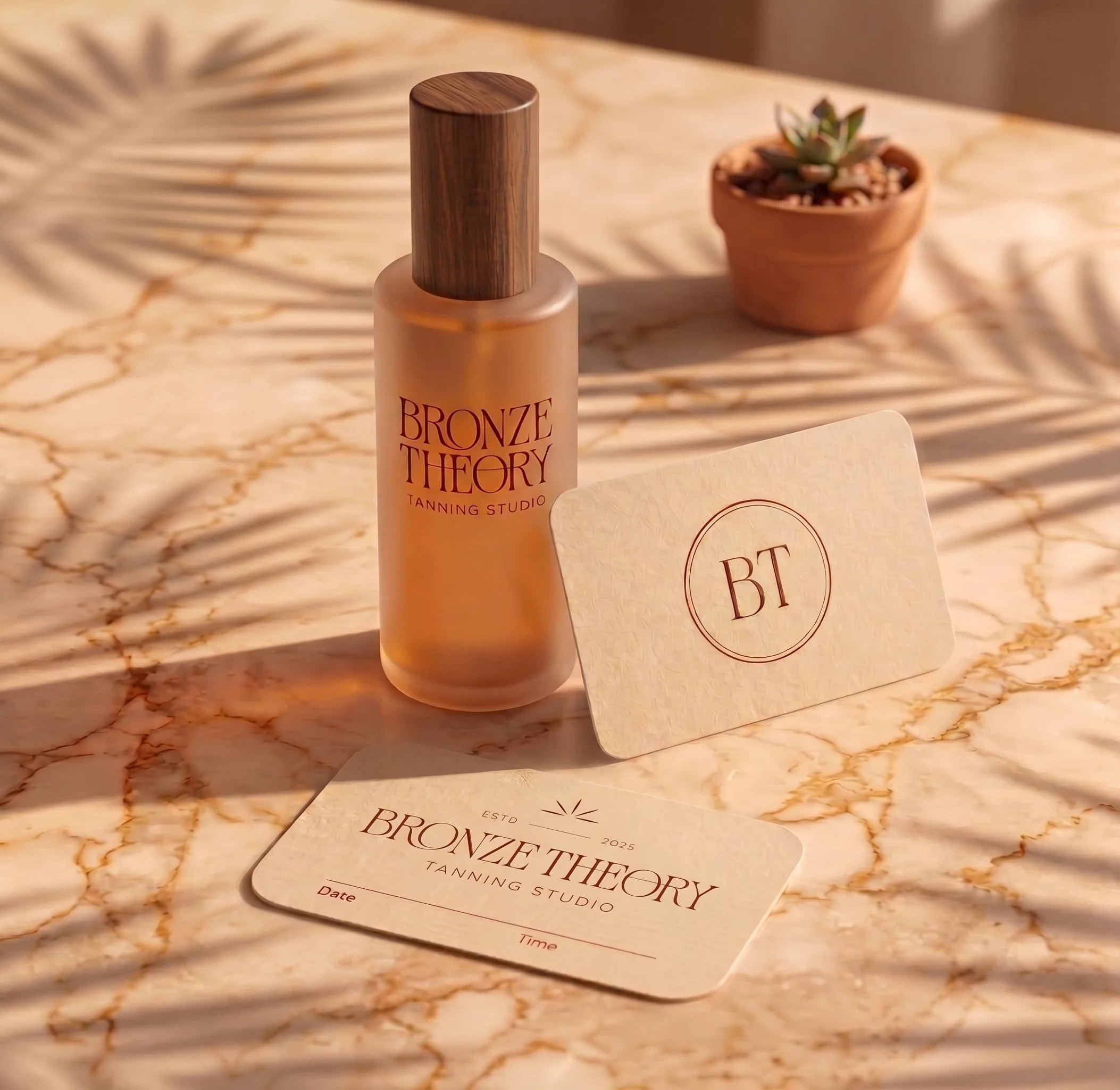
Product Packaging: Clean, minimalist skincare and tanning bottles utilizing the 'BT' monogram seal and secondary stacked marks.
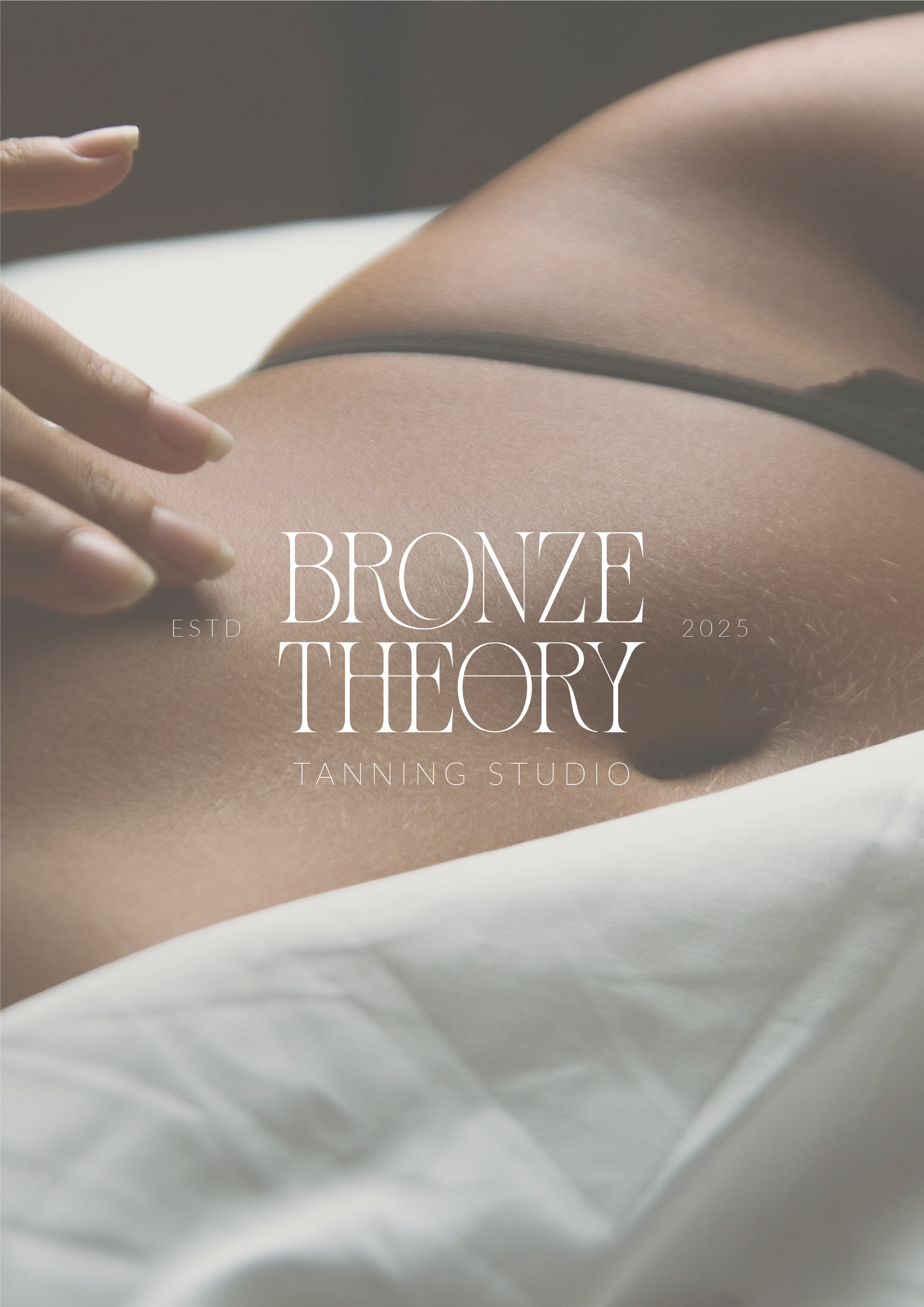
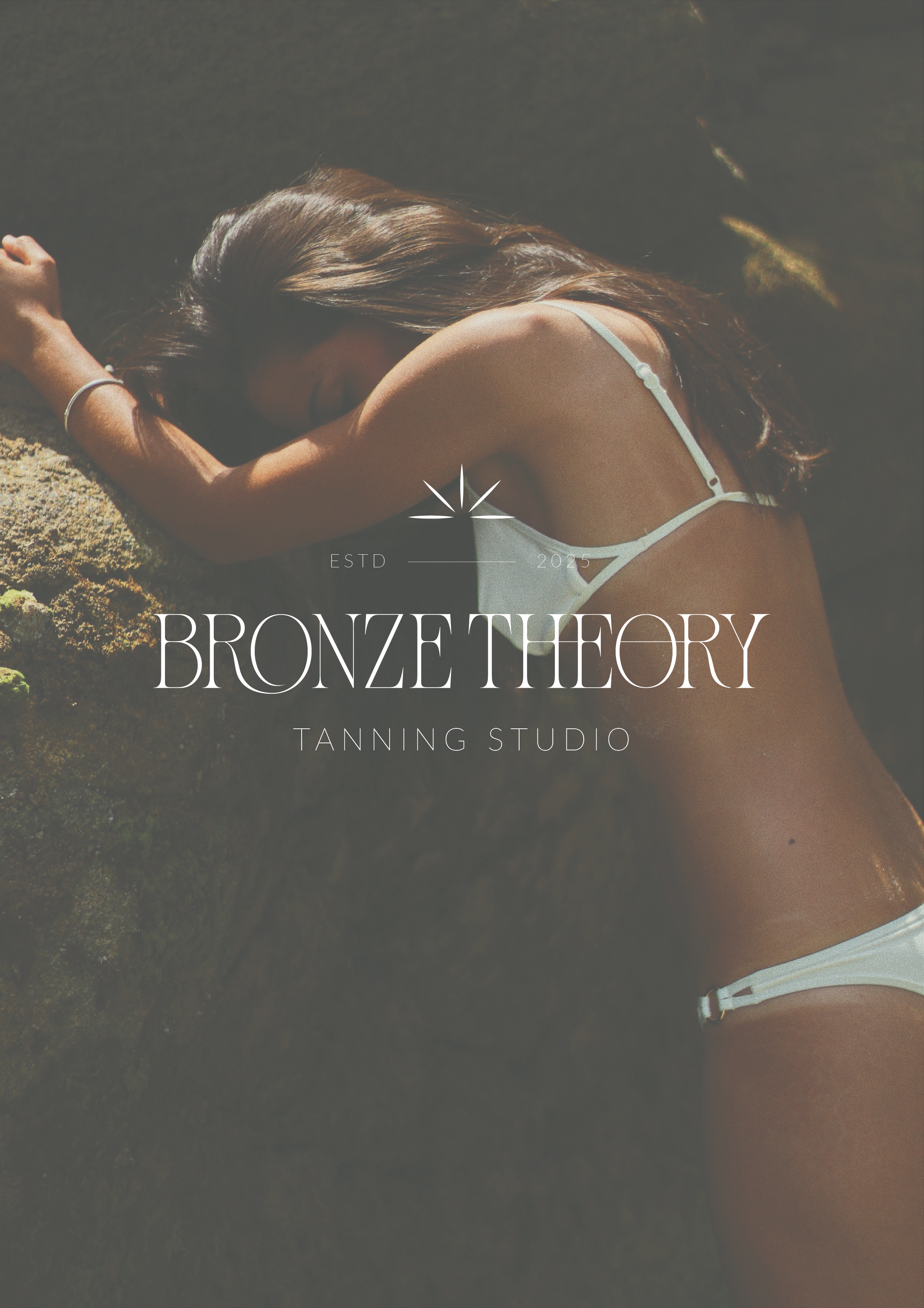
Digital Experience: An editorial web layout and social media suite that treats glowing skin as fine art through calm, spacious design.
-
By leaning into editorial restraint, Bronze Theory stands completely apart in its market. The resulting identity establishes an authoritative, high-end presence that resonates with clients seeking an elevated, premium self-care experience.