
Calm & Core
Wellness and Yoga
An elevated visual identity for a modern wellness and yoga studio bridging high-contrast elegance with mindful movement.
Client: CALM + CORE
Studio: Irina, Kay Studio Co
Year: 2026
Role & Deliverables: Brand Strategy, Visual Identity Systems, Custom High-Contrast Serif Typography, Responsive Logo Suite (Horizontal, Stacked, Monogram, Circular Seal), Brand Guidelines
-
The boutique wellness and yoga space often swings between two extremes: clinical minimalism or soft, bohemian cliches. CALM + CORE was created to introduce an editorial middle ground—a brand that feels as refined as a luxury fashion house while remaining deeply rooted in breath, mindfulness, and physical movement.
Kay Studio Co built a modular identity system anchored in dramatic high-contrast typography and subtle celestial motifs. The resulting visual language positions CALM + CORE as a modern sanctuary for intentional wellness and movement practices.
-
To position CALM + CORE as a premium wellness destination, the brand needed an identity system that felt simultaneously grounded and elevated.
Our strategic focus addressed three core goals:
Elevate Studio Aesthetics: Move away from generic lotus flowers and watercolor textures in favor of crisp, architectural typography.
Symbolize Inner Alignment: Introduce subtle graphic elements—like the central four-point star emblem—that signify clarity, balance, and inner focus.
Build a Responsive Logo Ecosystem: Design a suite of lockups that adapt effortlessly across yoga mats, studio doors, app interfaces, and retail apparel.
-
1. High-Contrast Editorial Serif
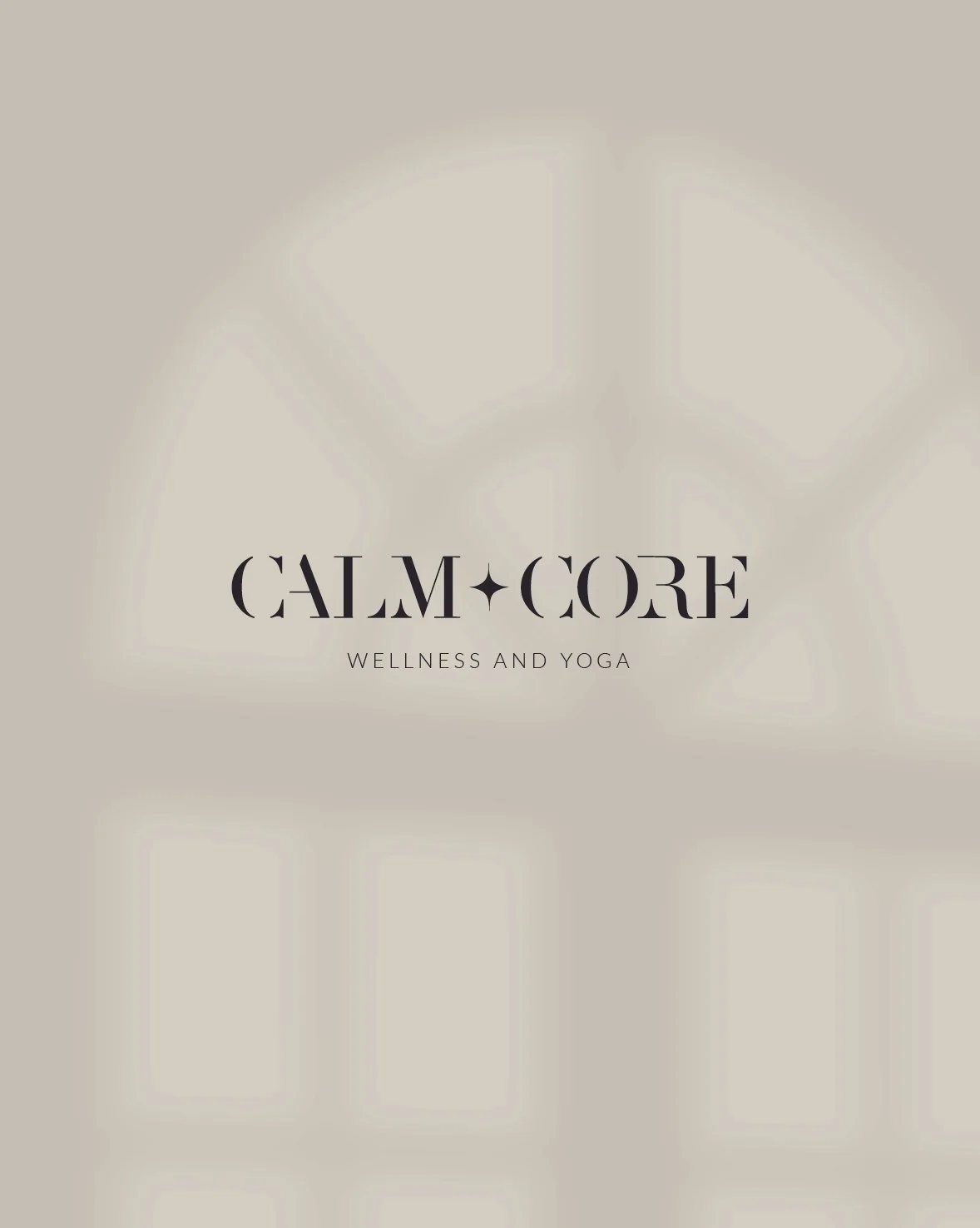
The foundational wordmark features a high-contrast serif typeface with dramatic thick-to-thin strokes and refined terminal curves. The letters evoke both structural strength ("CORE") and flowing fluidity ("CALM").
2. Responsive Logo & Submark Suite
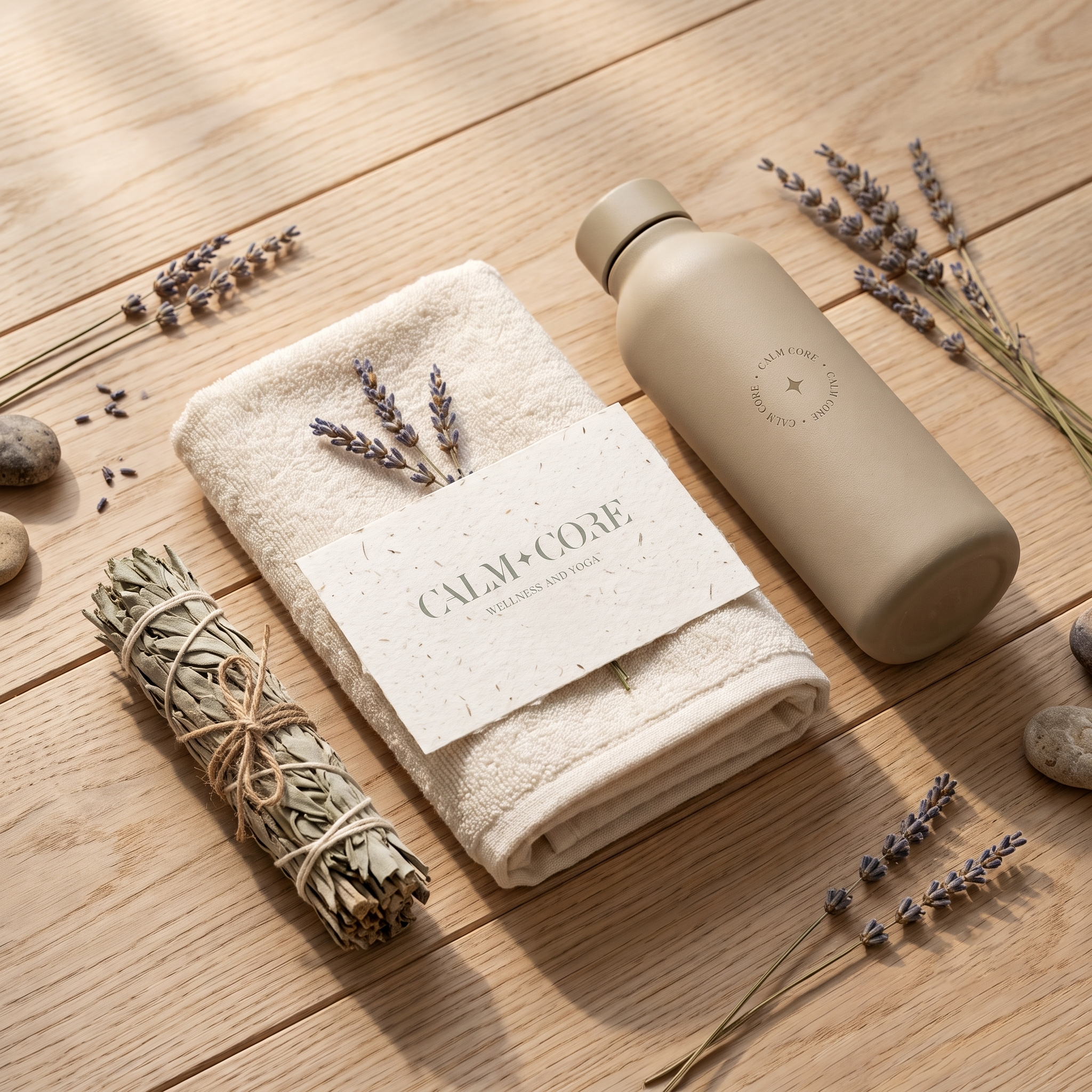
Primary Horizontal Lockup: A clean, single-line mark reading "CALM + CORE" with an integrated four-point star separator and a tracked sans-serif "WELLNESS AND YOGA" descriptor.
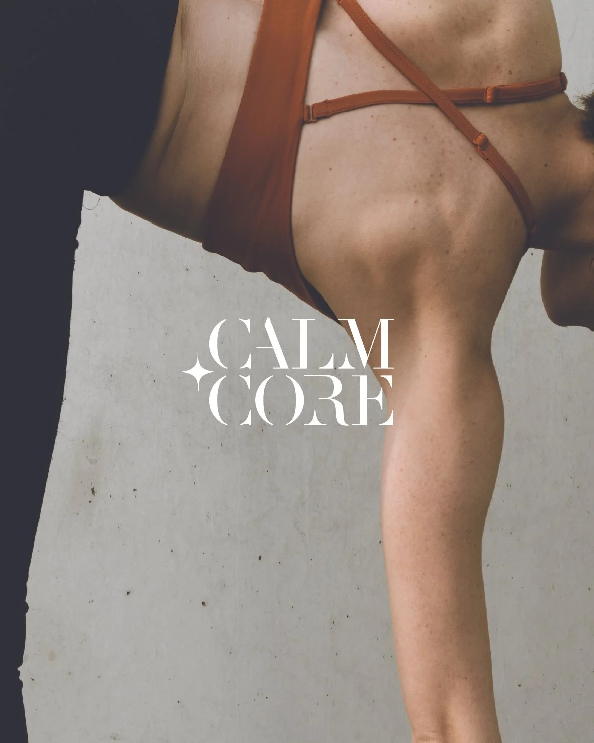
Stacked Two-Line Lockup: A compact, high-impact block arrangement with a four-point star accent resting on the left margin, engineered for square digital layouts and apparel tags.
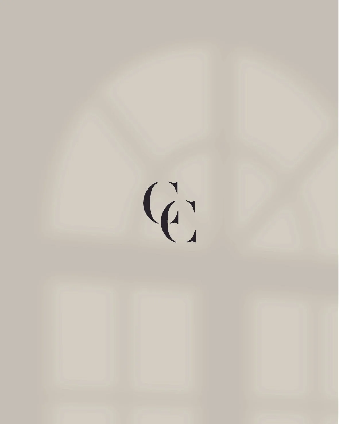
Overlapping Monogram ('CC'): An interlocked 'C' submark where two high-contrast letterforms intertw, symbolizing the dual connection between breath and movement.
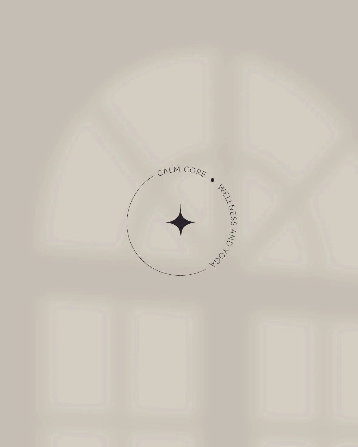
Circular Submark Seal: A repeating perimeter ring reading "CALM CORE" encircling a central four-point star, designed for social avatars, wax seals, and studio floor decals.
3. Minimalist Contrast Palette
Rooted in timeless clarity, the primary color space pairs stark, pure white with high-contrast jet black. This monochrome canvas creates maximum visual impact, allowing studio photography, warm lighting, and natural textures to take center stage.
-
Studio & Interior Touchpoints: Etched glass entrance doors, debossed studio membership cards, and minimalist directional signage utilizing the primary horizontal lockup.
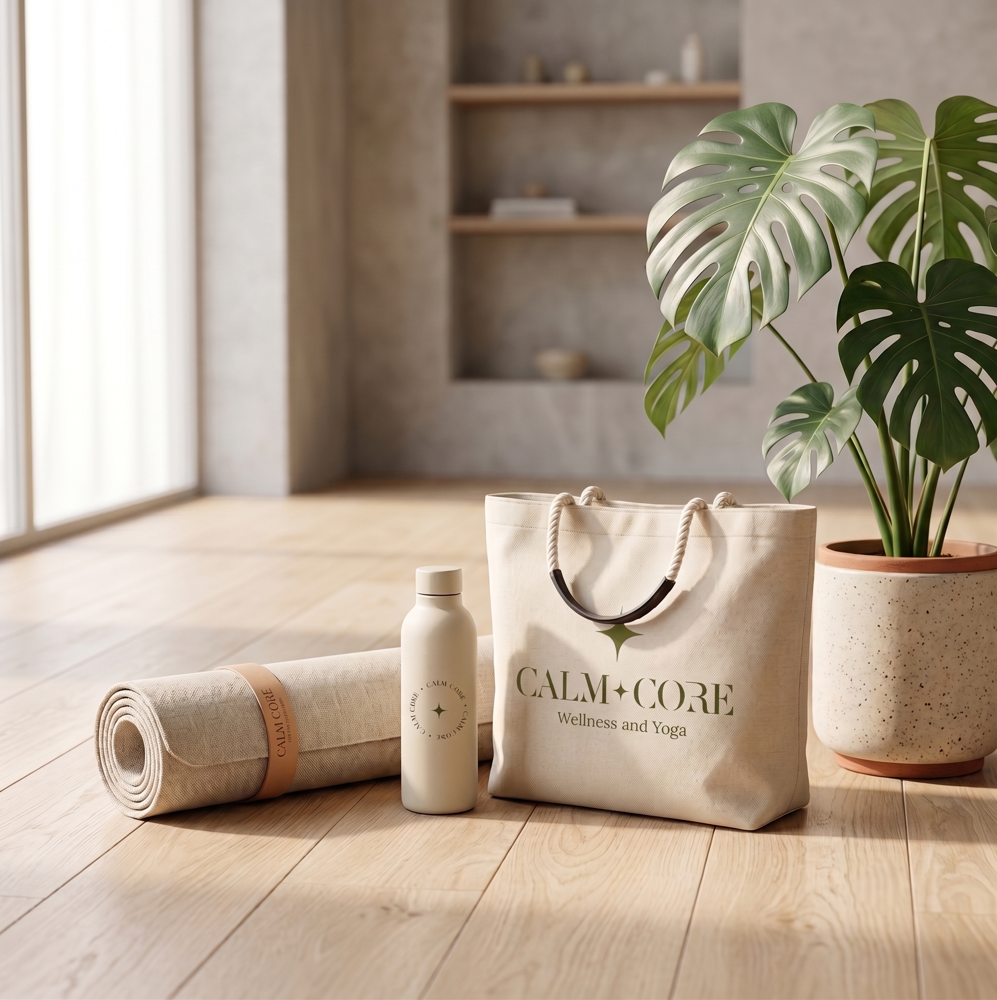
Wellness Apparel & Gear: Micro-embroidered interlocked 'CC' monograms on activewear, laser-engraved water bottles, and screen-printed yoga mats featuring the circular star seal.
Digital Ecosystem: A spacious, editorial website and app interface utilizing high-contrast typography and generous negative space for effortless class booking.
-
By pairing high-fashion typography with mindful graphic details, CALM + CORE establishes a distinct visual identity in the boutique studio market. The flexible logo suite provides the brand with total visual control—delivering a calm, authoritative presence across physical studio spaces and digital platforms.