
Kaya and Keo
Sustainable Fashion
An elevated, eco-conscious identity system bridging organic minimalism with luxury retail aesthetics.
Client: KAYA AND KEO
Studio: Kay Studio Co (Lead: Irina)
Year: 2026
Role & Deliverables: Brand Strategy, Visual Identity Systems, Custom Typographic Wordmark, Monogram Design (Mirror 'KK' Mark), Multi-Format Logo Suite, Packaging & Collateral Suite (Craft Boxes, Hangtags, Woven Garment Labels, Sticker Seals)
-
Sustainable fashion often faces a visual dilemma: looking overly bohemian and unrefined, or looking corporate and greenwashed. KAYA AND KEO was founded to offer a modern alternative—ethically crafted apparel built on timeless design, organic materials, and quiet luxury.
Kay Studio Co developed a visual system anchored in architectural typography and tactile, earth-conscious packaging. The resulting identity elevates sustainable fashion into an aspirational lifestyle brand, proving that eco-friendly practices and high-end aesthetics belong together seamlessly.
-
To position KAYA AND KEO as a leader in elevated sustainable apparel, the brand needed an identity that felt grounded, tactile, and distinct.
Our strategy addressed three core objectives:
Redefine Sustainable Aesthetics: Move away from generic leaf motifs and raw earthy cliches in favor of crisp, modern minimalism.
Build a Dynamic Monogram System: Design an instantly recognizable mark that functions effortlessly on small garment tags, metal hardware, and circular seals.
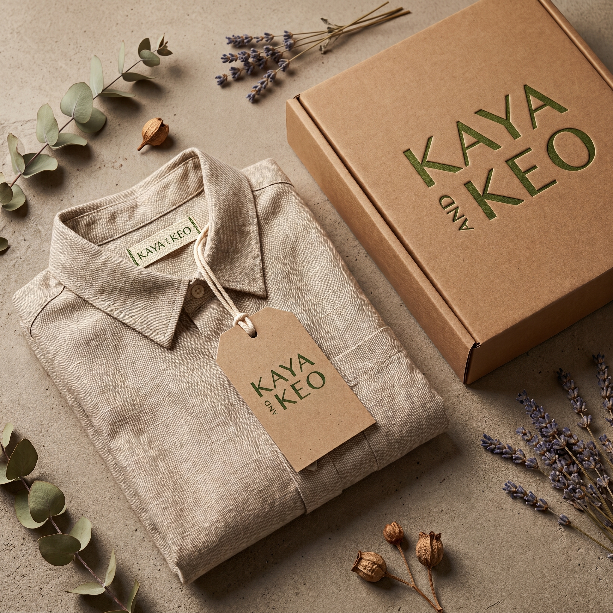
Create a Tactile Unboxing Experience: Structure sustainable packaging touchpoints—using unbleached Kraft papers, woven linen tags, and custom sticker closures—that reinforce quality at every unboxing stage.
-
1. High-Contrast Typographic Wordmark
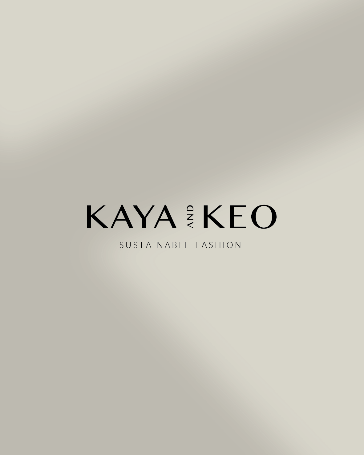
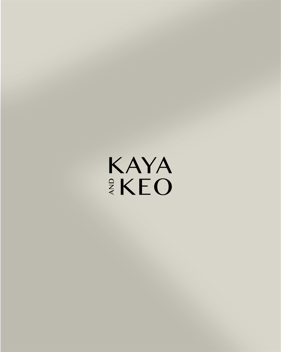
The primary logo features a high-contrast sans-serif wordmark paired with a rotated vertical "AND" detail. This structural arrangement provides visual balance while anchoring the brand in modern editorial design.
2. The Mirrored 'KK' Monogram & Logo Suite
The identity system scales across touchpoints with tailored logo variations:
Primary Horizontal Lockup: A balanced lockup featuring "KAYA AND KEO" paired with the clean "SUSTAINABLE FASHION" descriptor.
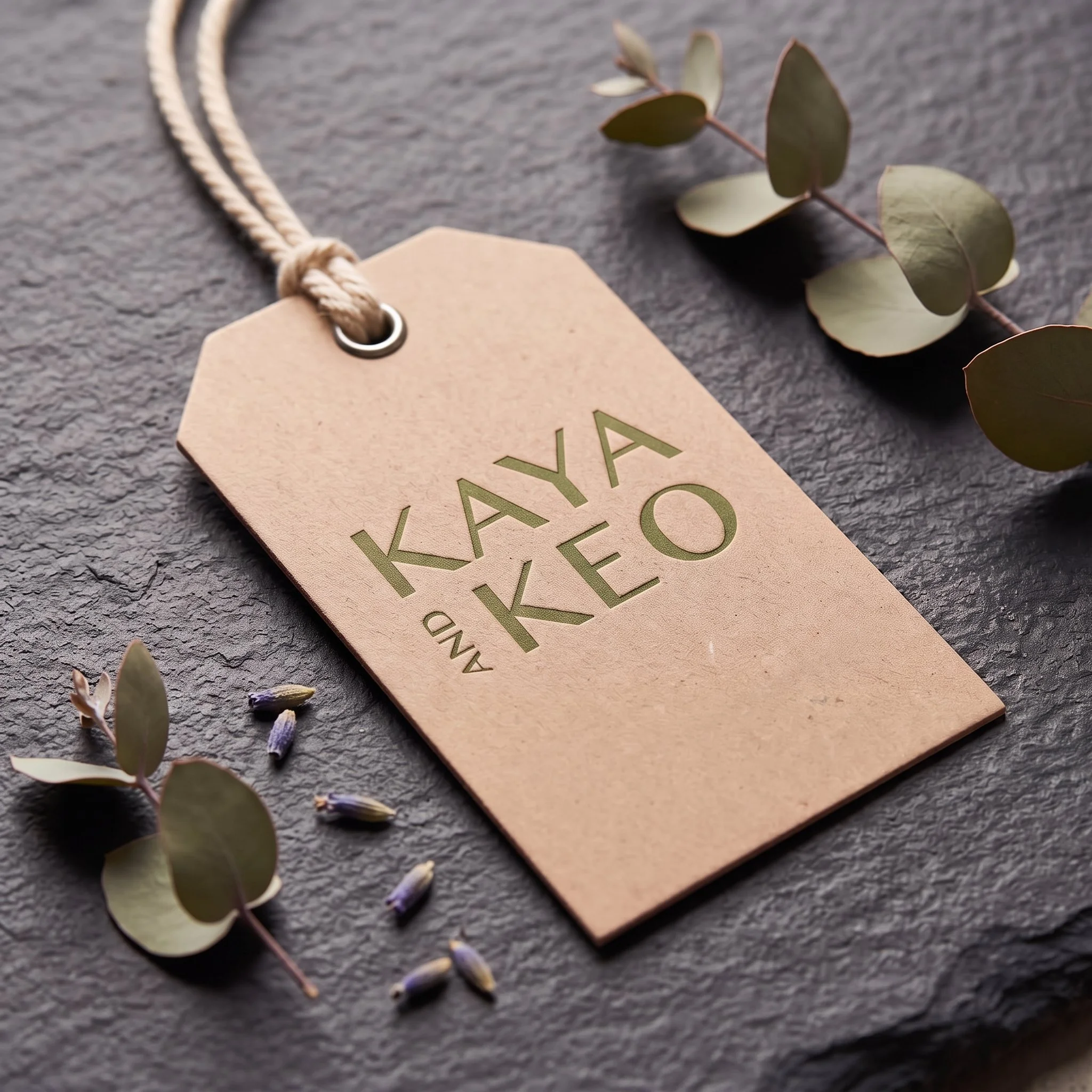
Stacked Vertical Lockup: A compact, high-impact block arrangement where "KAYA" rests directly above "KEO" with a vertical "AND" sidebar—engineered for square tags and box covers.
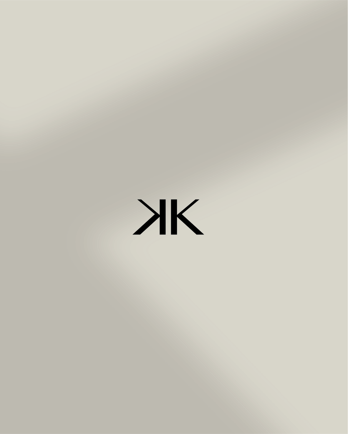
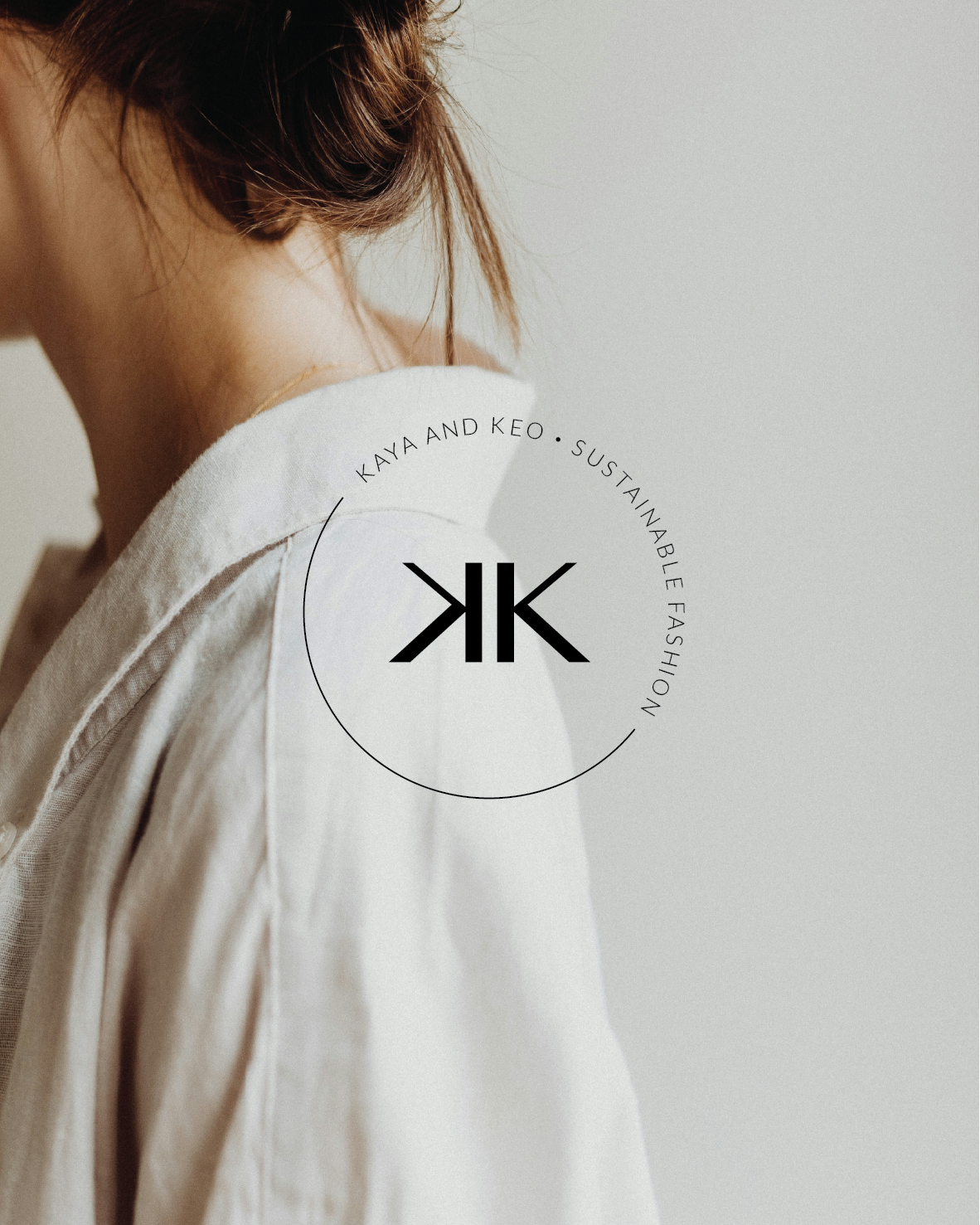
The Mirrored 'KK' Monogram: A striking geometric mark combining a mirrored 'K' with a forward 'K', separated by a clean central pillar. This mark serves as the primary submark for garment embroidery, hardware, and circular seals.
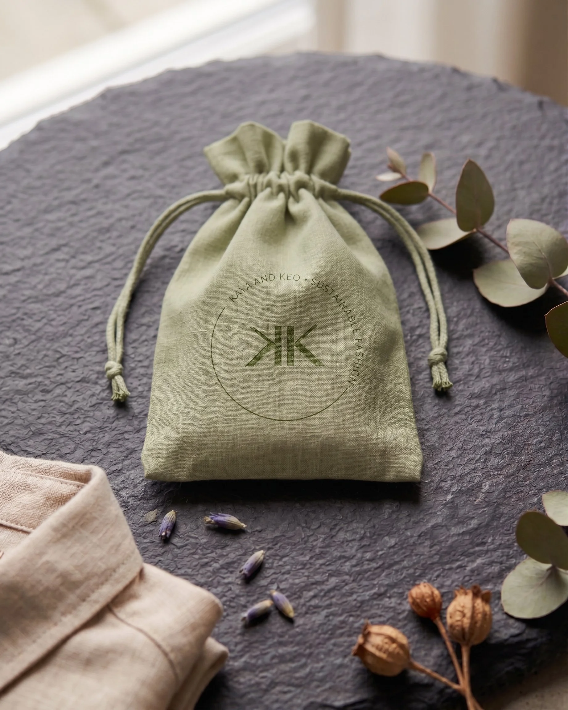
Circular Submark Seal: An arched typography ring ("KAYA AND KEO • SUSTAINABLE FASHION") framing the central 'KK' monogram, designed for stickers, social avatars, and tissue wraps.
3. Earth-Anchored Color Palette
Oatmeal & Linen Neutrals (#E3E0D6): Soft, unbleached background tones that mirror natural organic cotton and flax fibers.
Charcoal Black (#0F0F0F): Provides high-contrast legibility across typography and graphic seals.
Warm Terracotta & Natural Kraft: Adds organic warmth to unboxing boxes and recycled paper hangtags.
-
Garment & Apparel Touchpoints: Woven neck labels sewn directly into linen shirts, paired with thick Kraft paper hangtags tied with natural cotton cord.
Sustainable Unboxing Suite: Natural Kraft gift boxes debossed with the stacked "KAYA AND KEO" logo, alongside white lid covers secured with black custom sticker seals.
Editorial & Digital Touchpoints: Clean lifestyle imagery framed by the circular 'KK' submark seal for social media campaigns, lookbooks, and e-commerce storefronts.
-
By pairing geometric precision with natural textures, KAYA AND KEO establishes a powerful, eco-conscious presence in the fashion market. The new identity system allows the brand to command a premium position—delivering an unmistakable mark of quality from garment tags to the unboxing experience.