

Natalie Engler
Rechtsberatung
A refined personal brand identity and print collateral suite positioning an independent Swiss legal consultant with quiet confidence.
Client: Natalie Engler Rechtsberatung
Studio: Irina, Kay Studio Co
Year: 2026
Role & Deliverables: Brand Strategy, Identity Systems, Monogram & Logo Suite (Primary Wordmark, Monogram Box Lockups, Stacked Variations), Color Palette Architecture, Business Card Design, Editorial Service Flyers (Flyer/Folder Design)
-
Legal consultation often suffers from cold, overly rigid, or intimidating corporate branding. For Natalie Engler—providing expert legal advisory services in the Bern and Thun regions—the challenge was to bridge legal competence with personal accessibility.
Kay Studio Co designed an elegant, editorial visual identity anchored in rich forest green and warm cream tones. Pairing a high-contrast serif typeface with a geometric double-frame monogram, the system establishes immediate credibility while remaining approachable and clear.
-
Independent legal practitioners need a visual identity that commands immediate trust from clients facing complex legal questions, without feeling cold or distant.
Our strategy focused on three core objectives:
Convey Legal Authority without Intimidation: Create a timeless visual aesthetic that reflects professional competence while welcoming personal consultation.
Establish a Flexible Monogram System: Build a distinctive 'NE' monogram mark that functions seamlessly across small digital avatars, luxury business cards, and document headers.
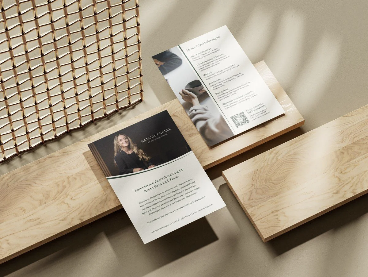
Structure Skimmable Editorial Print Assets: Design client-facing informational flyers (covering family law, employment law, tenancy, and debt enforcement) that translate complex legal offerings into clear, structured services.
-
1. The Logo & Monogram Suite
The typography combines traditional legal stature with modern editorial polish:
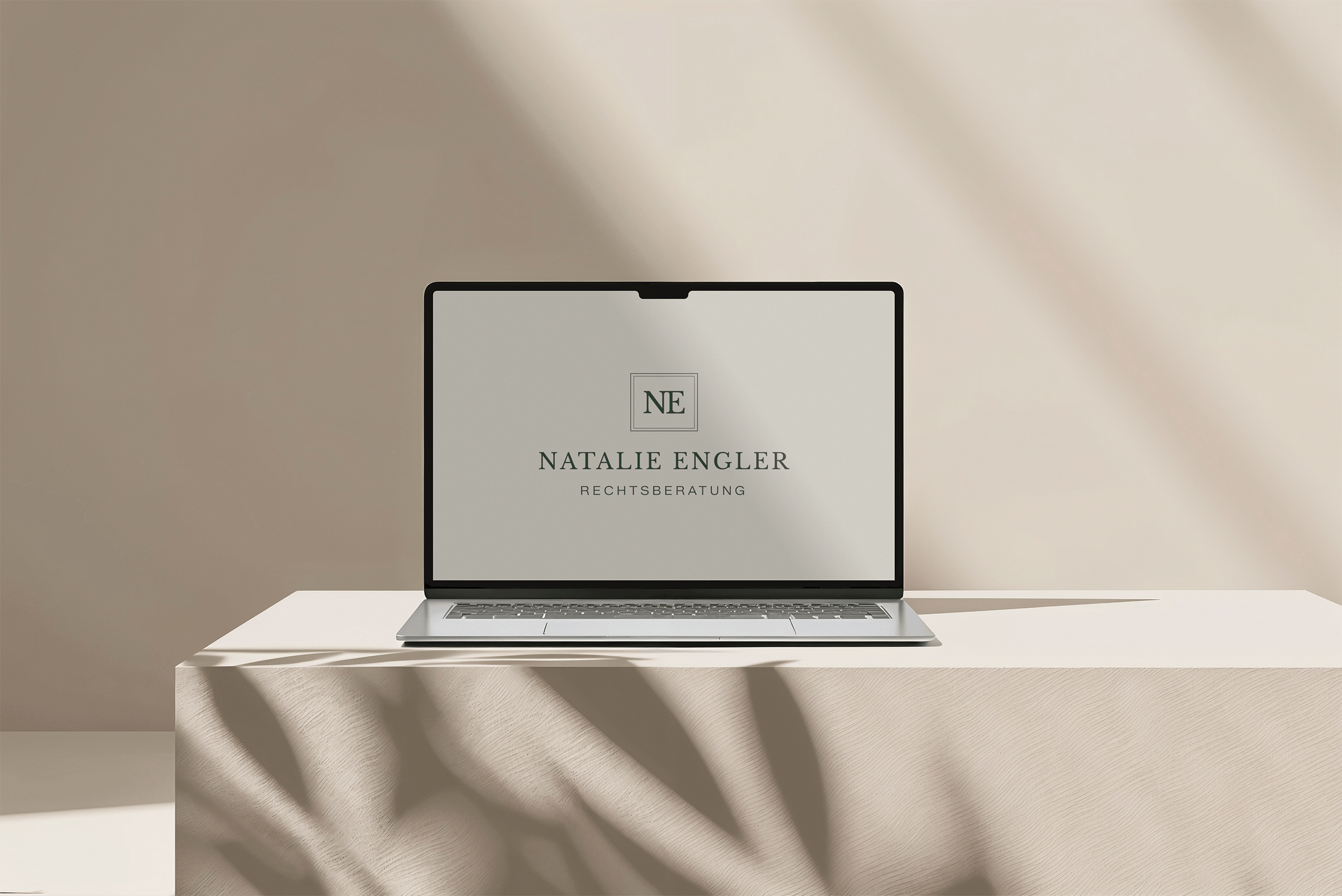
Primary Wordmark: A classic serif logotype ("NATALIE ENGLER") paired with clean sans-serif tracking for "RECHTSBERATUNG", establishing structural balance.
The 'NE' Monogram Box: A geometric double-line framed mark containing the "NE" initials, symbolizing structure, legal protection, and stability.
Stacked & Horizontal Variations: Flexible lockup configurations that adapt smoothly between horizontal business cards, vertical editorial flyers, and square digital profiles.
2. Sophisticated Swiss Palette
Deep Forest Green: Communicates stability, growth, trust, and understated Swiss elegance.
Warm Alabaster Cream: Replaces stark clinical white with an inviting, tactile backdrop for both print and digital applications.
Soft Sage Accent: Used for secondary divider lines and subtle geometric framing.
-
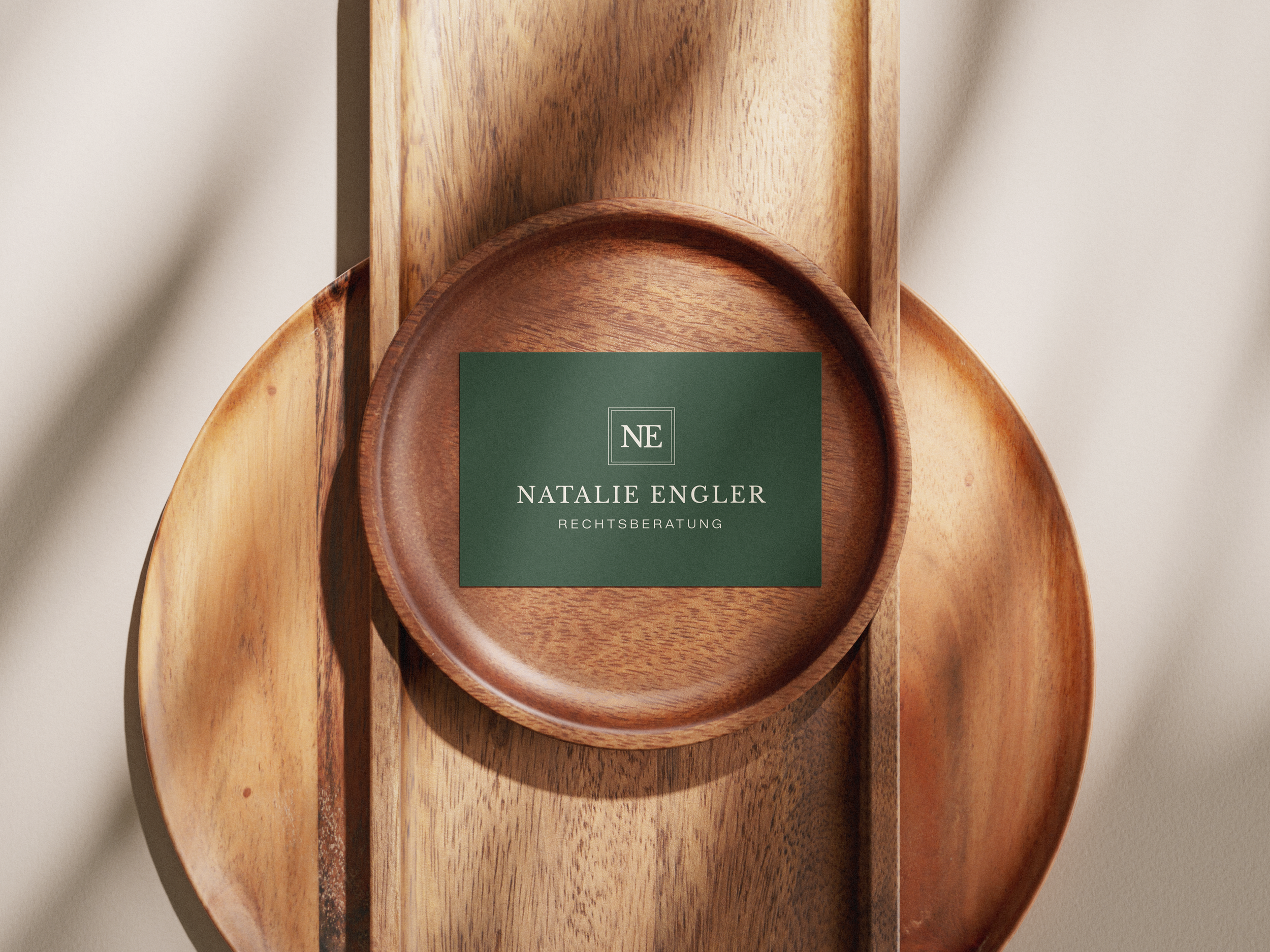
Premium Business Cards: Dark forest green cardstock printed with warm cream typography and the central 'NE' boxed mark, creating an impactful first impression.
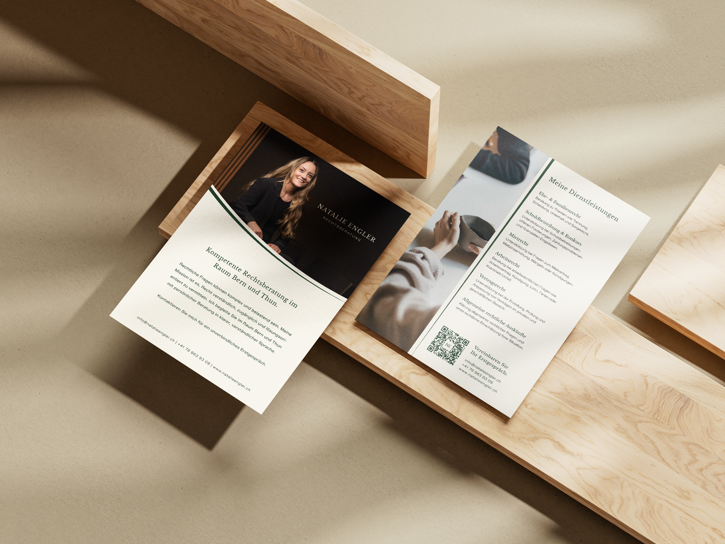
Editorial Service Flyers: Two-sided informational cards designed for prospective clients in Bern and Thun. Features include an approachable profile section, structured service breakdowns (Ehe- & Familienrecht, Mietrecht, Arbeitsrecht, Contract Law), and a direct QR code call-to-action for consultation bookings.
Digital Applications: High-contrast logo assets optimized for digital consultation decks, email signatures, and web headers.
-
The identity provides Natalie Engler Rechtsberatung with a timeless, highly polished brand presence. By balancing legal authority with warm editorial design, the visual system successfully differentiates her practice—establishing a trustworthy destination for accessible, high-level legal counsel.