
Ophelia
Brow Artist
An editorial brand identity positioning an independent brow specialist as a destination for quiet precision and detail-driven beauty.
Client: Ophelia Brow Artist
Studio: Irina, Kay Studio Co
Year: 2025
Role & Deliverables: Brand Strategy, Visual Identity Systems, Custom Sculptural Serif Typographic Wordmark, Responsive Logo Suite (Horizontal, Stacked, Submarks), Brand Guidelines
-
In an age of overly styled, trend-driven beauty, how does an artist known for quiet precision stand out? For Ophelia, a brow specialist of exceptional skill, the answer was not to shout, but to build an enduring world of calm confidence.
Kay Studio Co built a cohesive brand ecosystem that transforms Ophelia’s practice into a curated beauty edit—shifting the client perception from a routine beauty service to the definitive destination for considered, architectural brow design.
-
The beauty aesthetics market is heavily saturated with loud, hyper-trend-focused visuals and aggressive marketing cues that diminish the focus on individual artistry.
Our strategy focused on three key goals:
Signal Structural Expertise: Design a visual identity that mirrors the exactness, symmetry, and architectural discipline required in high-end brow design.
Embrace Editorial Restraint: Create a whisper-quiet visual system with generous white space, keeping the focus entirely on Ophelia’s craftsmanship and client transformations.
Build a Scalable Logo Suite: Develop primary and secondary logo variations that adapt gracefully across micro-touchpoints, print collateral, and studio signage.
-
1. High-Contrast Sculptural Serif Typography
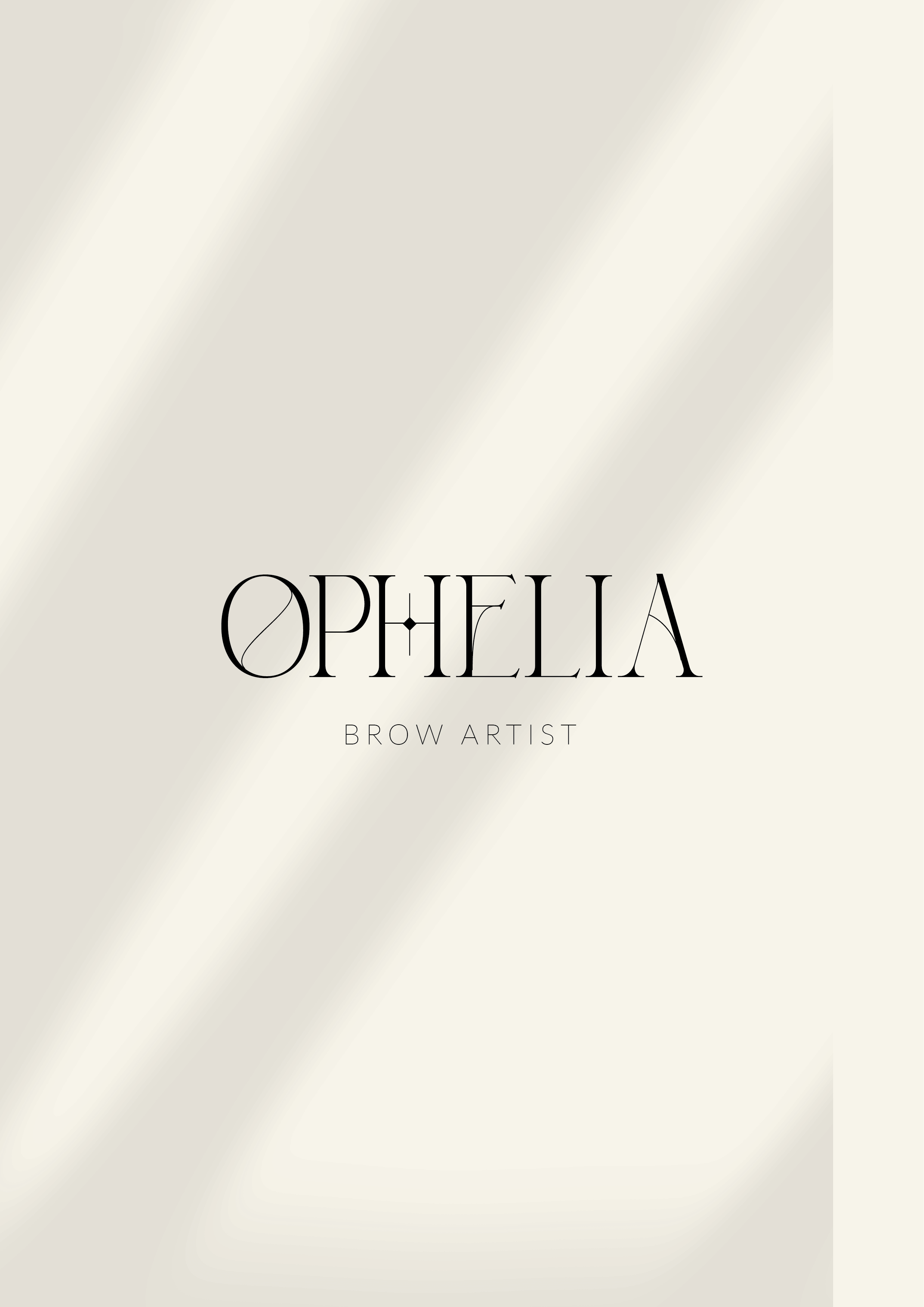
The foundational wordmark acts as a precise instrument—its dramatic thick-to-thin contrast and elegant letterforms signaling high-level expertise:
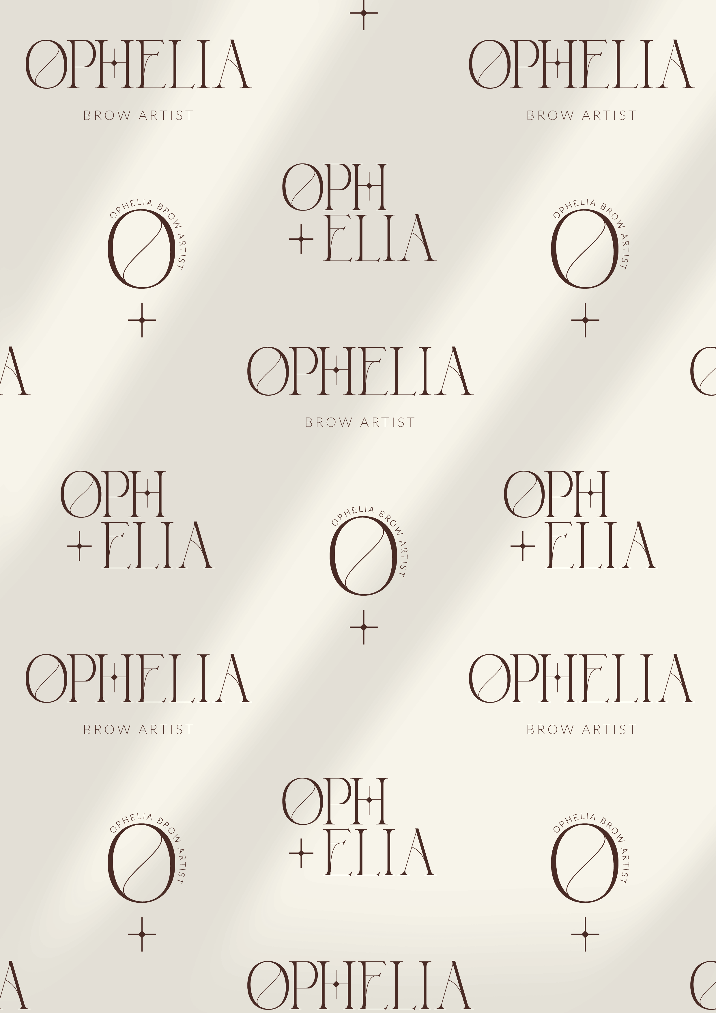
Custom Geometric 'O': Features an elegant architectural slash line running through its center, echoing precision measurement and symmetry.
Diamond-Star 'H' Crossbar: Integrates a delicate four-point diamond sparkle detail into the crossbar of the 'H', subtlely evoking radiance, transformation, and polished perfection.
2. Responsive Logo Suite
Primary Horizontal Wordmark: A balanced lockup featuring "OPHELIA" paired with a clean, widely tracked sans-serif "BROW ARTIST" descriptor.
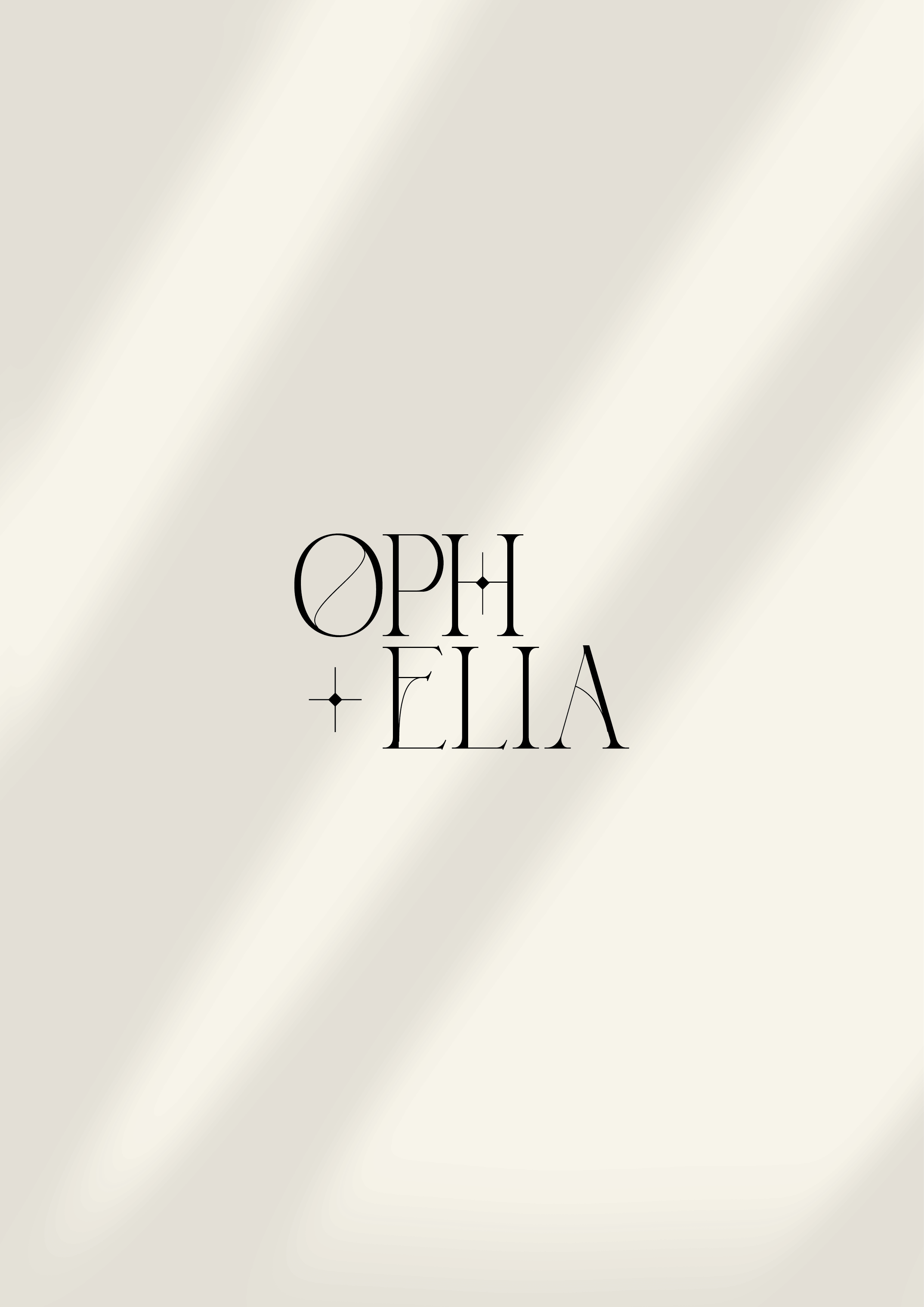
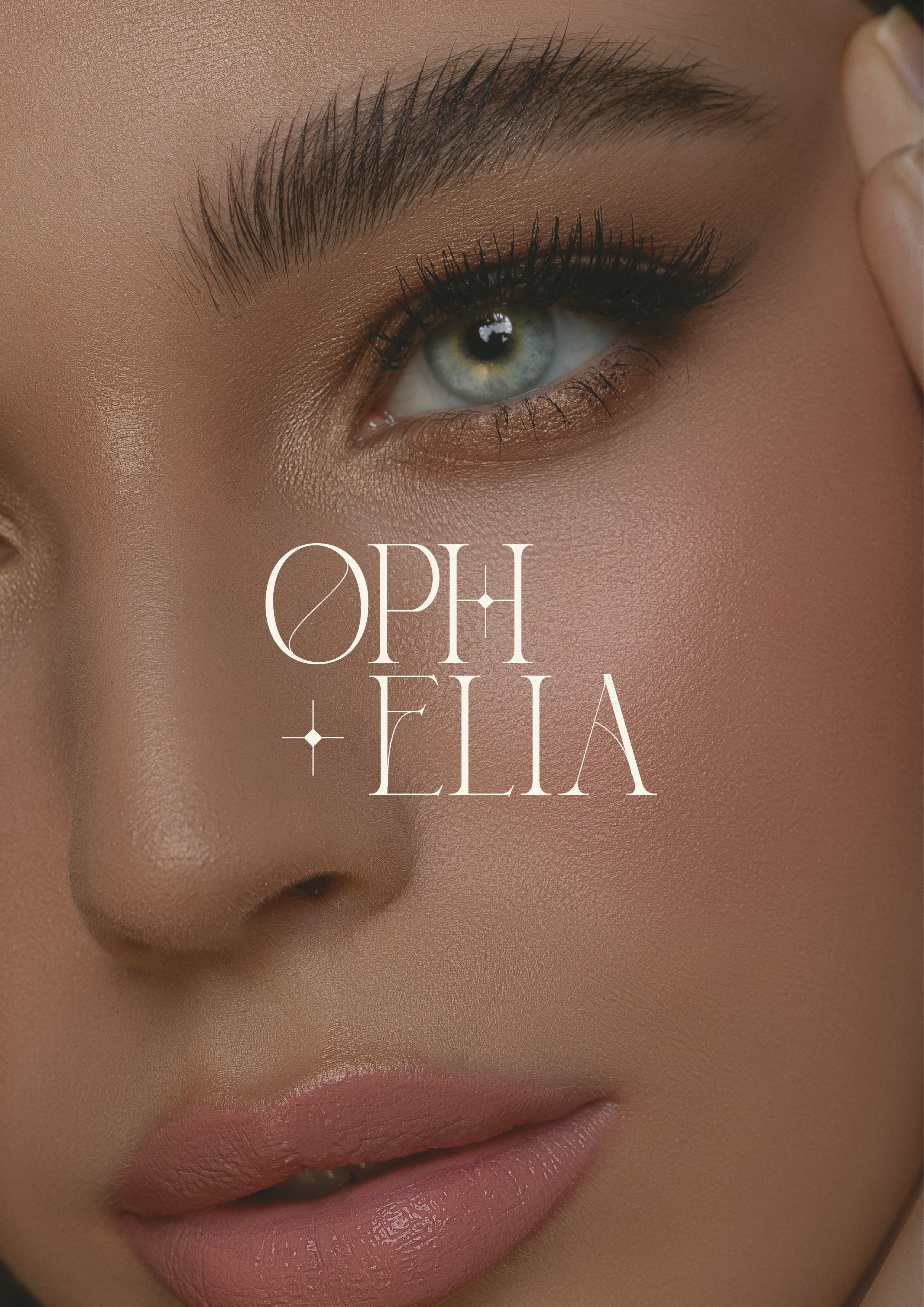
Stacked Editorial Lockup: An artistic two-line configuration ("OPH + ELIA") featuring a delicate four-point star accent, engineered for square social media frames, vertical hangtags, and compact print layouts.
3. Whisper-Quiet Neutral Palette
Rooted in curated calm, the palette pairs soft alabaster cream backgrounds with high-contrast charcoal typography. This minimal, sun-softened canvas creates a spacious field that allows imagery and fine typographic details to breathe effortlessly.
-
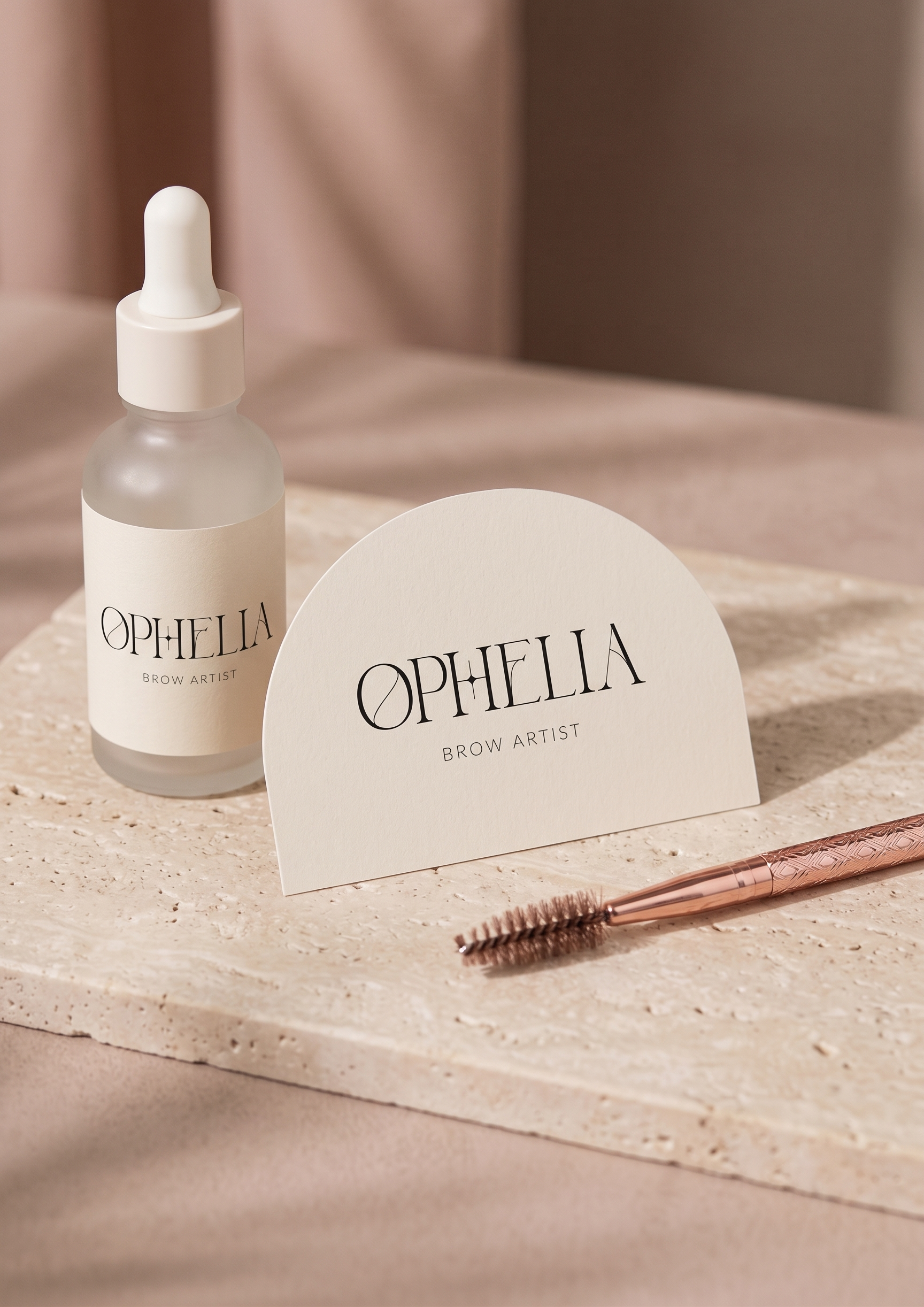
In-Studio Experience: Architectural door lettering, debossed appointment menus, and minimal consultation cards printed on heavy, tactile paper stocks.
Packaging & Client Care: Sleek aftercare envelopes, branded ribbon wraps, and product packaging featuring the stacked "OPH + ELIA" mark.
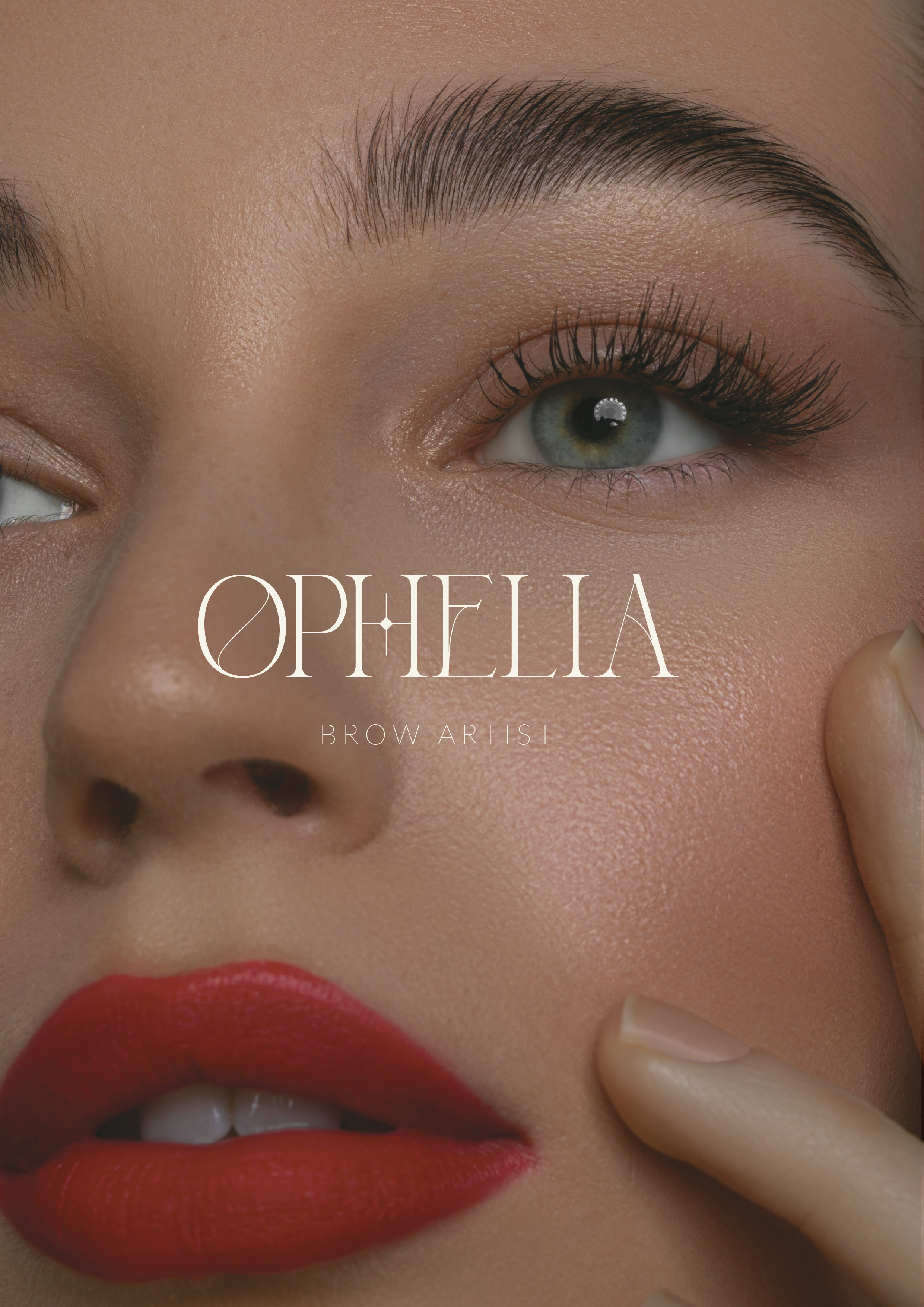
Digital Presence: An editorial social media grid and website architecture that treats brow artistry as fine art through generous negative space and quiet visual harmony.
-
The resulting identity provides Ophelia with a distinct, authoritative presence anchored in intention. By framing brow design through the lens of architectural beauty and restrained luxury, the brand successfully establishes Ophelia as a premier destination for considered, detail-driven artistry.