
Repeat
Work. Rest. Repeat
A dynamic, rhythm-driven brand identity system for a modern lifestyle and fitness brand anchored in momentum and discipline.
Client: REPEAT
Studio: Irina, Kay Studio Co
Year: 2026
Role & Deliverables: Brand Strategy, Visual Identity Systems, Custom Bold Typography & Motion Wordmark, Responsive Logo Suite (Horizontal, Stacked, Arrow Iconography), Color Palette Architecture, Digital UI Mockups, Apparel & Merchandise Design
-
Fitness and lifestyle brands often rely on hyper-aggressive messaging or fleeting workout trends. REPEAT was founded on a different premise: that true progress comes from the sustainable, rhythmic loop of discipline—working hard, resting intentionally, and returning to the routine.
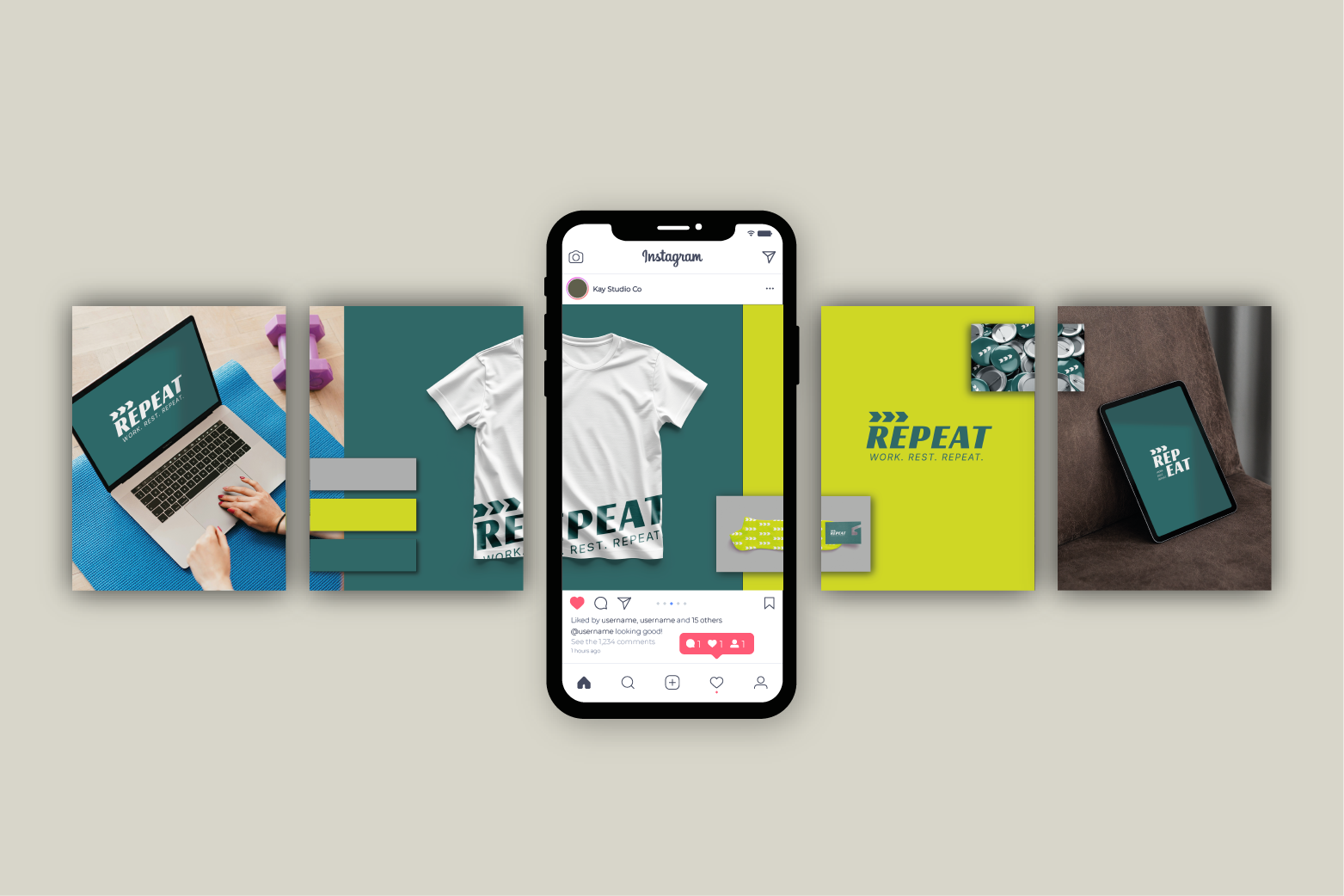
Kay Studio Co developed a bold, energetic visual identity anchored in forward-moving chevron icons and heavy, italicized typography. The resulting brand ecosystem balances athletic grit with modern minimalist style, creating an unmistakable presence across digital devices, apparel, and daily routines.
-
To build a lifestyle brand that resonates with high-performers, the visual identity needed to feel kinetic, disciplined, and instantly recognizable.
Our strategy focused on three core objectives:
Visualize Momentum: Create custom iconography that visually translates the concept of loops, progression, and forward motion.
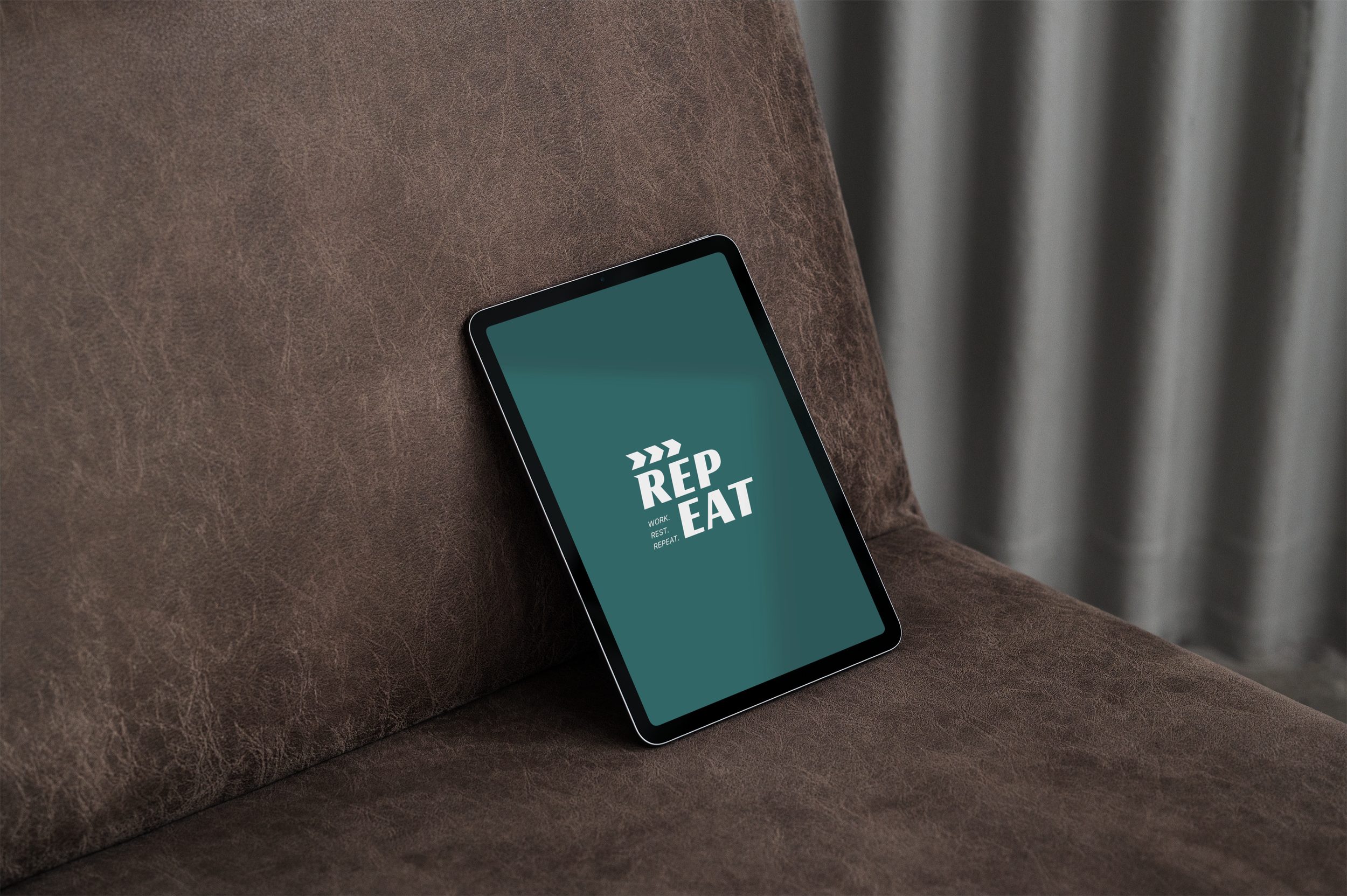
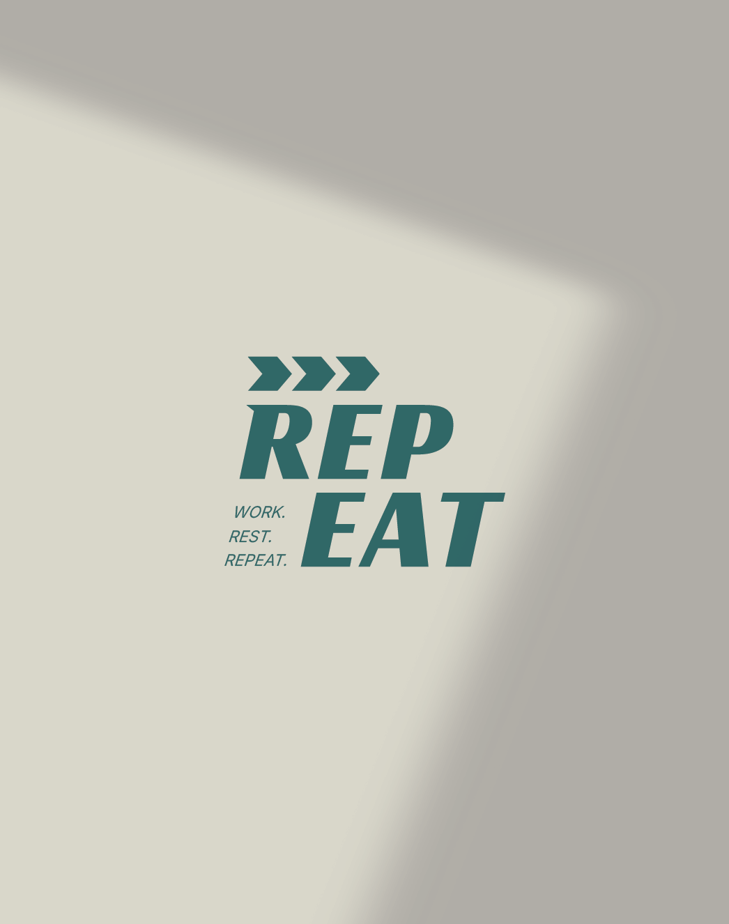
Master Flexible Typography: Design a wordmark that functions dynamically in both horizontal and stacked configurations (splitting seamlessly into REP / EAT or REPEAT).
Build an Engaging Lifestyle Ecosystem: Translate the brand system onto wearable apparel, digital workspace screens, and dynamic social media touchpoints.
-
1. Kinetic Motion Iconography & Wordmark
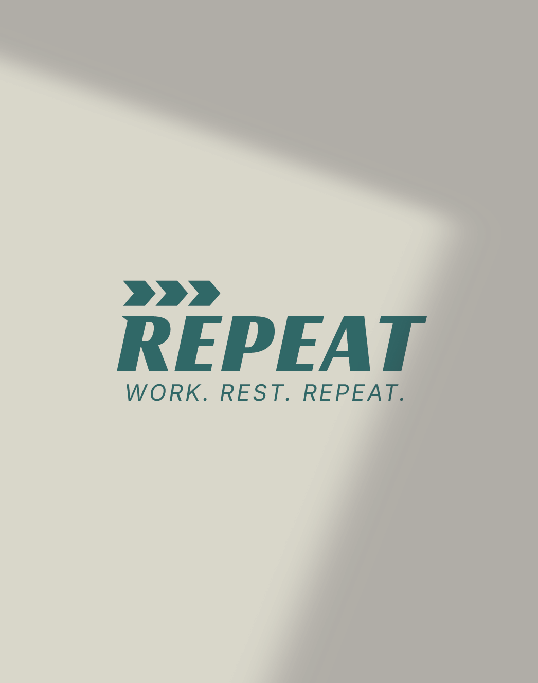
The Triple Chevron Mark: A distinctive sequence of three forward-pointing chevrons sits above the logotype, symbolizing velocity, repetition, and continuous cycles.
Heavy Italicized Wordmark: A bold, slanted sans-serif typeface that leans forward, embodying action, speed, and continuous momentum.
Modular Stacking (REP / EAT): The wordmark is engineered to split into two powerful stacked blocks, creating a punchy, editorial grid layout for merchandise and digital headers.
2. High-Energy Color Palette
Deep Teal-Green (#2D6A6C): Serves as the primary grounding tone, offering sophisticated athletic authority.
Vibrant Olive-Lime (#A3C11E / Accent Grids): A high-contrast secondary punch color that brings modern streetwear energy and digital vibrancy to the system.
Crisp White & Soft Neutrals: Provide clean breathing room across apparel prints and UI backdrops.
-
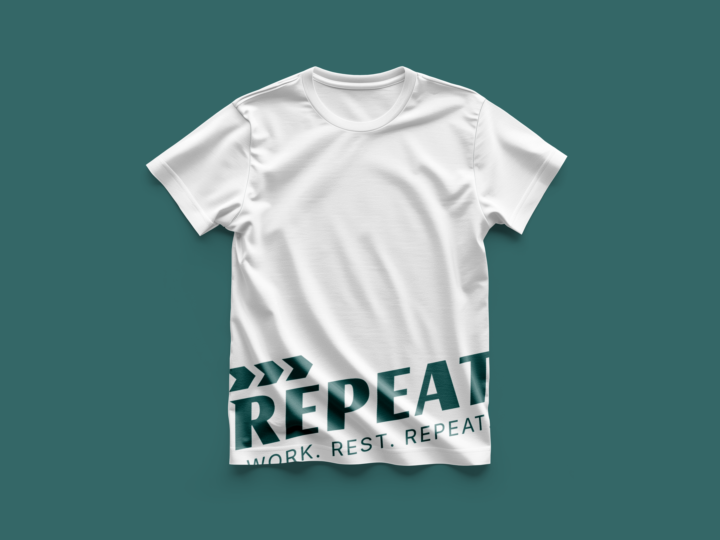
Apparel & Merchandising: Bold screen-printed graphics wrapping dynamically across clean white tees, workout gear, and lifestyle wear.
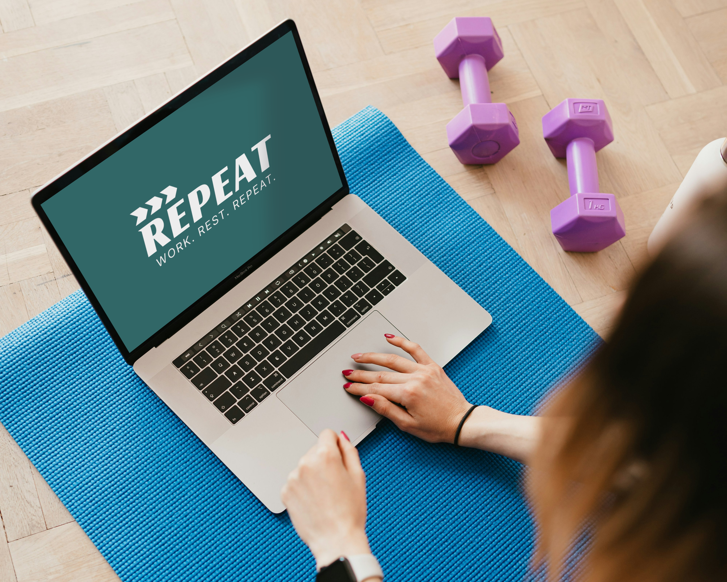
Digital Ecosystem & UI: Desktop and tablet screen mockups featuring the deep teal branding during active work and fitness tracking routines.
Social & Editorial Suite: Dynamic digital grids showcasing the brand's core ethos—Work. Rest. Repeat.—across multi-platform campaigns.
-
The resulting visual system gives REPEAT an authoritative, high-impact presence in the active lifestyle space. By turning the philosophy of disciplined repetition into a striking design language, the brand successfully positions itself as a staple for modern performance-driven individuals.